The Vector Gallery - responsive website
Project overview
The product
I’ve created a responsive to help people, who are not very familiar with the art world, to choose what exhibition they want to go to and let them easily book tickets.
Project duration
March 2025 - April 2025
The problem
Visitors of The Vector Gallery find it hard to find and decide what exhibition they want to go to.
The goal
The Vector Gallery website will let users choose and book tickets to an exhibition to go to for users who aren’t familiar with the art world.
My role
Solo UX Designer (end-to-end)
Responsibilities
I conducted user research, made wireframes, made mockups, made lo-fi and hi-fi prototypes and conducted usability studies for user testing to ensure seamless implementation of the final design.
User research
Summary
I interviewed users about their experience finding an exhibition to go to, and buying tickets on a museum website. I also asked how users decide what exhibition to go to and the main reason why they go to exhibitions. It was useful getting to know how users like to express their creativity.
Assumptions I made going into the research were that it is easy to decide what exhibition to go to, for example because of recommendations of friends. This assumption changed after conducting the research, as not every user has as much knowledge of art. It showed me how users might need help choosing what exhibition they would like to go to and that it can be overwhelming to go through a museum website not knowing what to look for.
Pain points
There is too much information on current museum websites, which makes it hard to find what exhibitions are currently showing. A clear overview with concise text is important to guide the design moving forward.
Some users with limited knowledge of art find it hard to decide what exhibition to go to. A tool to help users decide what exhibition to go to is important to guide the design moving forward.
Users who are not technologically savvy find it hard to use the online ticket booking system and do not know how to get discounts. An easy online ticket booking system is important to guide the design moving forward.
It is difficult to find what date an event is, that the museum is holding, and if they will happen again. A clear calendar with events is important to guide the design moving forward.
Hard to decide what exhibition to go to
No clear overview of current exhibitions
Difficult to find what date events are
Hard to book tickets online
Persona
Oscar Laurent
Oscar is a retired art teacher who needs a website to easily buy exhibition and event tickets to go to with his grandchild because he is not technologically savvy.
Age: 68
Education: BA Fine Arts
Hometown: Paris, France
Family: married, one adult child and one grandchild
Occupation: retired, previously art teacher
“Art brings people together”
Goals
to enjoy the freedom of his retirement
to do activities with his partner
to share his knowledge of art with his grandchild
to visit museum events
Frustrations
knows a lot about art and would like to see something new
finds it hard to book tickets online
finds it hard to figure out how to get his senior discount
Oscar is a former art teacher who wants to enjoy the freedom of his retirement with his partner. As he is interested in art he likes to go to exhibitions, but feels like he has seen a lot of art already. He finds it hard to use an online ticket booking system and prefers to buy tickets at the museum, so he can get his senior discount. He would like to visit events hosted by a museum. As he is very passionate about art he would like to visit a museum with his grandchild to share his knowledge.
User journey map
Oscar’s user journey showed me the flow a user might go through to decide what exhibition to go to and helped me pin point the benefits of creating a website with a clear overview of exhibitions and an easy way to buy tickets, for a user who isn’t technologically savvy.
Persona:
Oscar Laurent
To see new exhibitions, buy discounted tickets, visit museum events and share his knowledge of art with his grandchild
Goal:

Sitemap
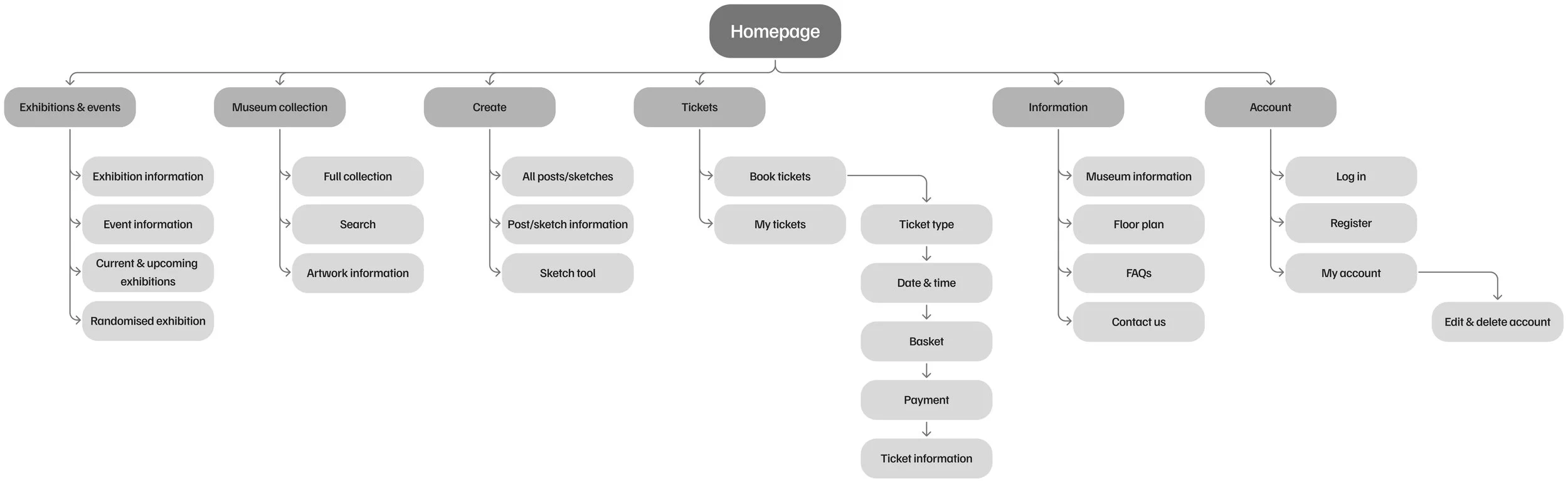
I built user-focused flows with the goal to ensure that my users can successfully complete their key objectives and improve overall website navigation, while reducing the existing pain points. The structure I chose was designed to make things simple and easy to find.
Wireframes
Paper wireframes
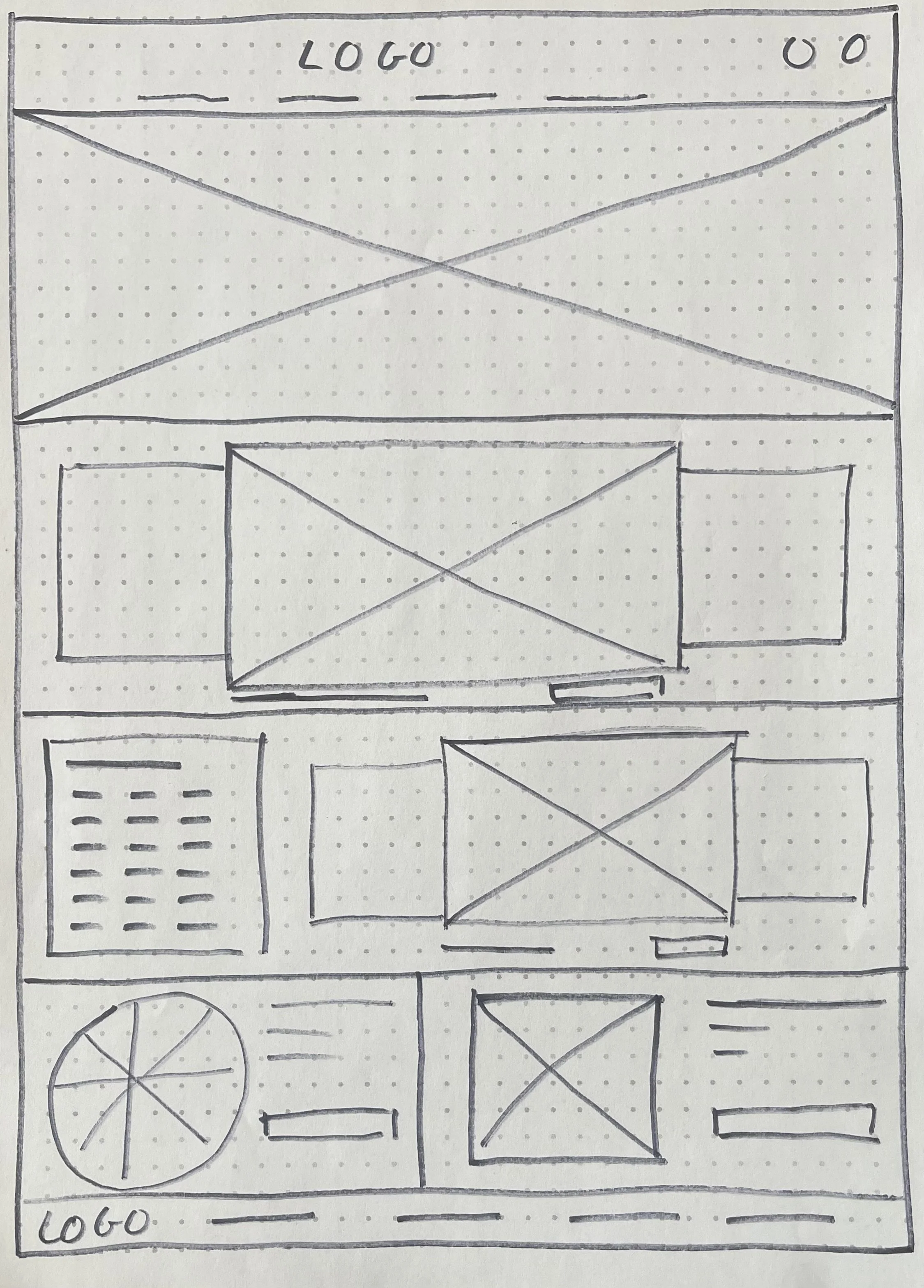
I sketches out paper wireframes for each screen, focusing on core features identified during user research, keeping user pain points and user flow in mind.
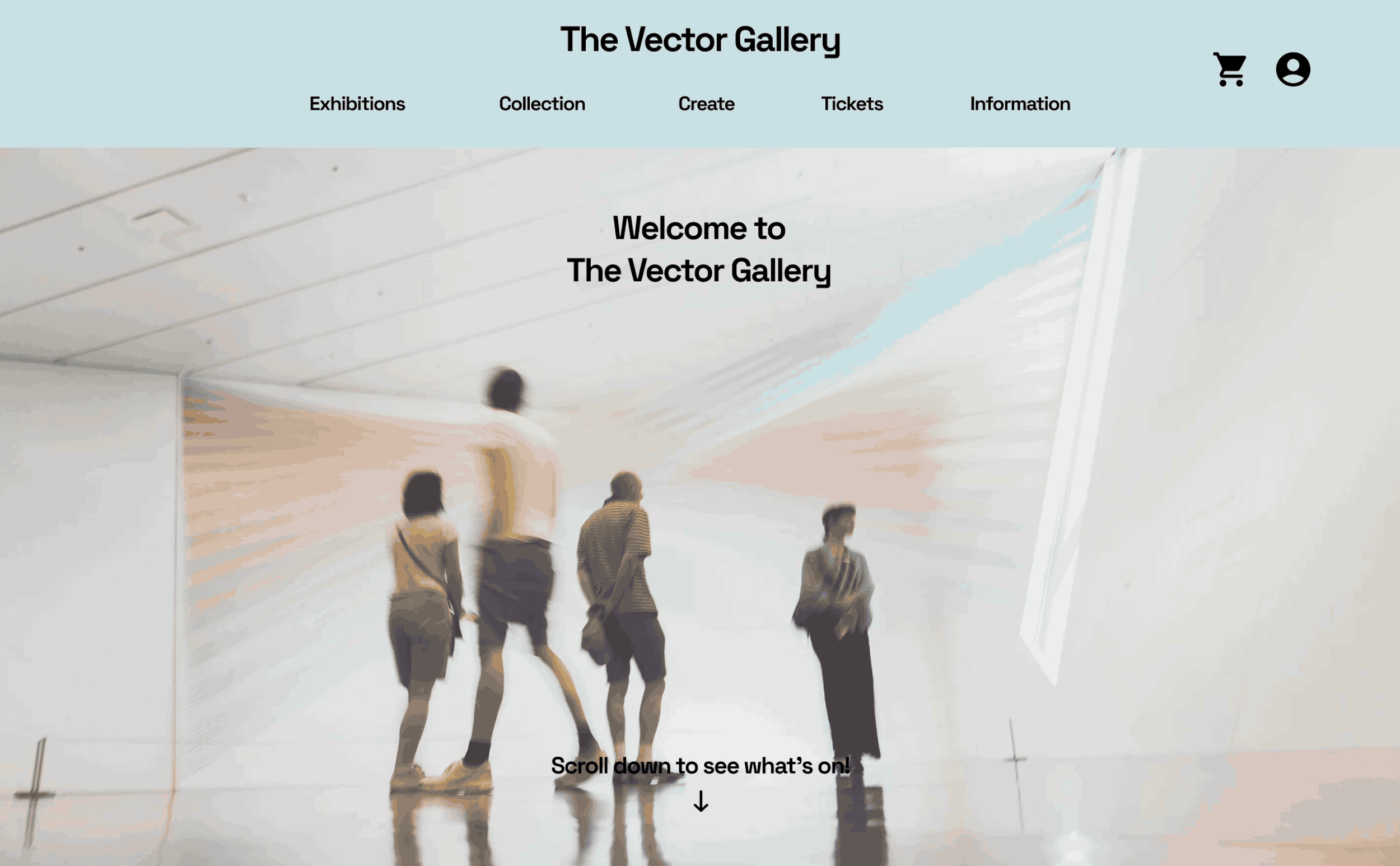
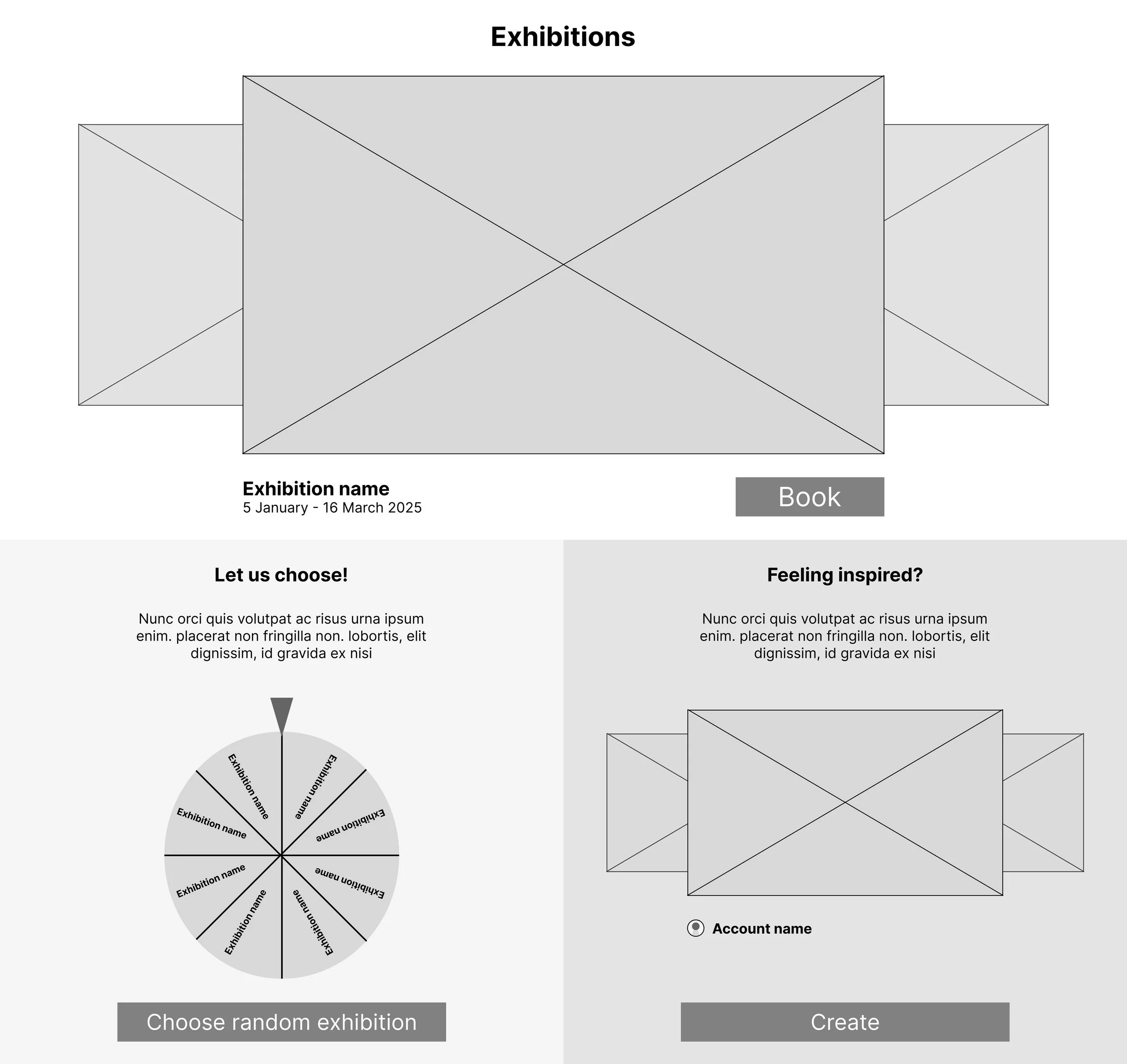
The home screen paper wireframes focus on a clear overview and easy browsing experience.
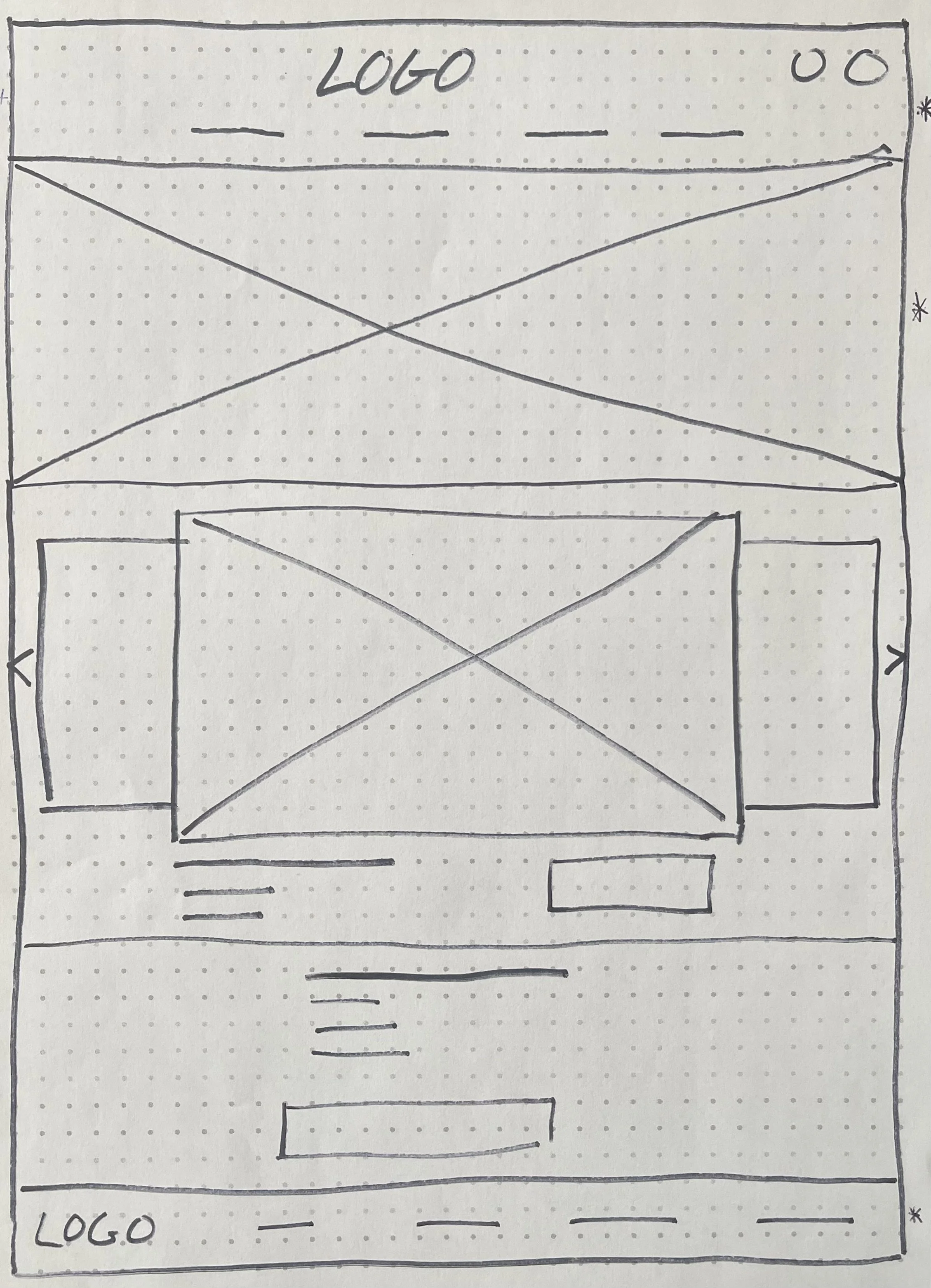
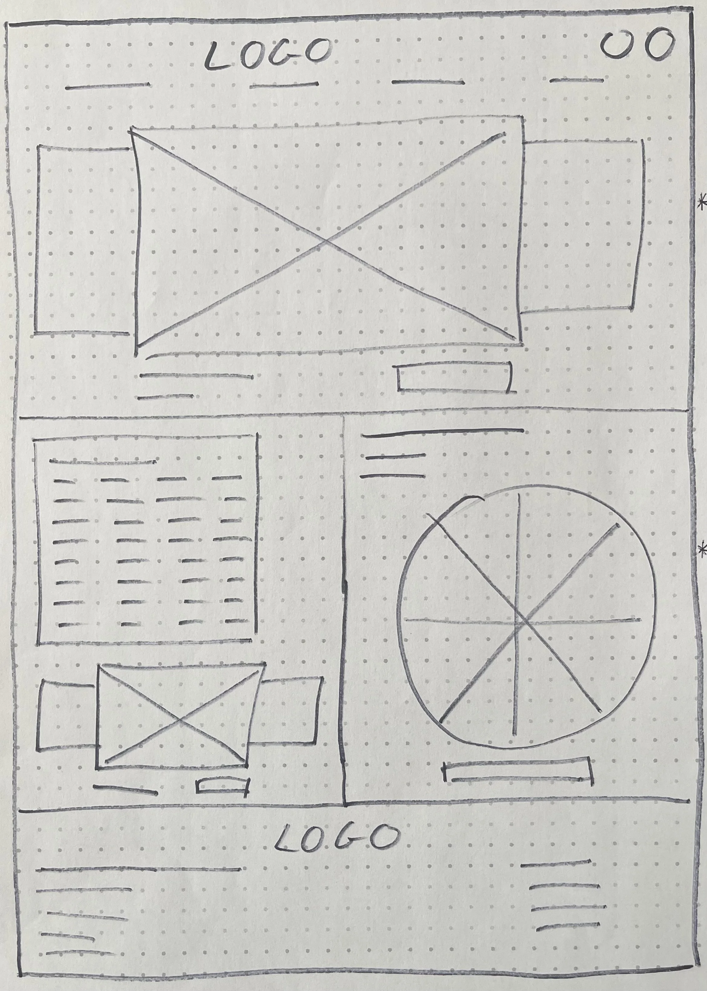
Stars were used to mark the elements of each sketch that would be used in the initial digital wireframes.
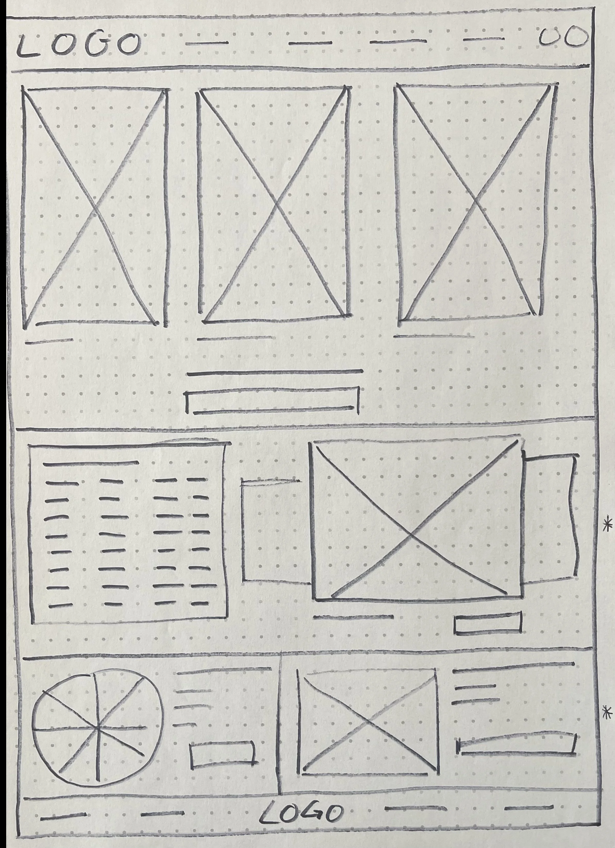
Refined paper wireframe
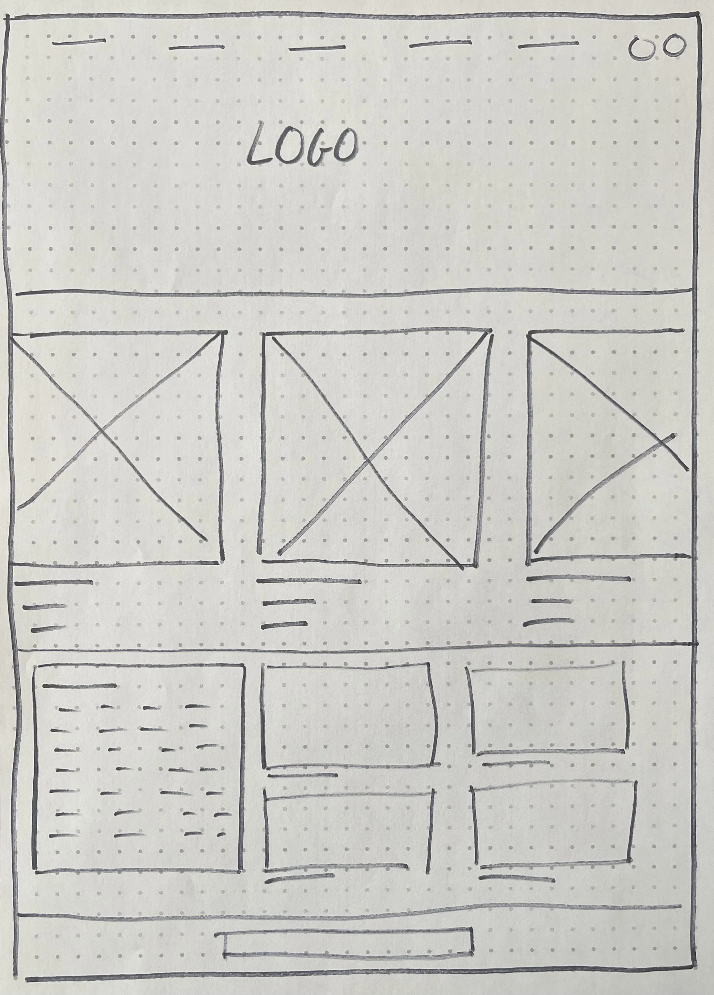
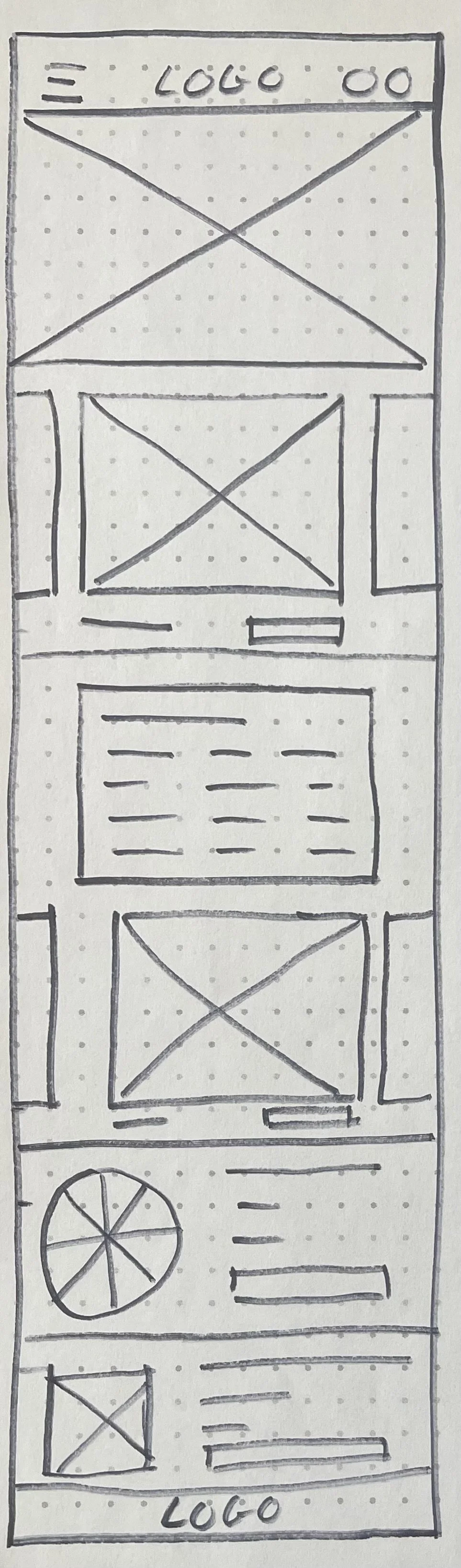
Paper wireframe screen size variations
To make sure the site would be fully responsive, I started working on designs for additional screen sizes. I made paper wireframes of the home screen for tablet and mobile, as users use the site on different devices.
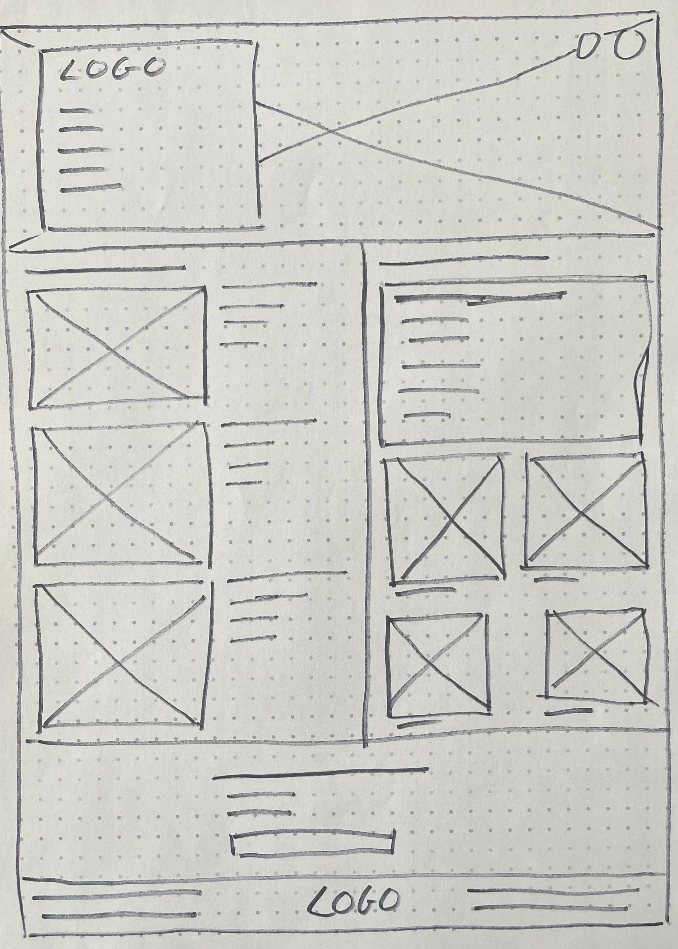
Digital wireframes
Easy to locate and useful buttons and visual elements, like images, was a key part of moving from paper wireframes to digital wireframes. These wireframes represent the addressing of user pain points and improvement of user experience.
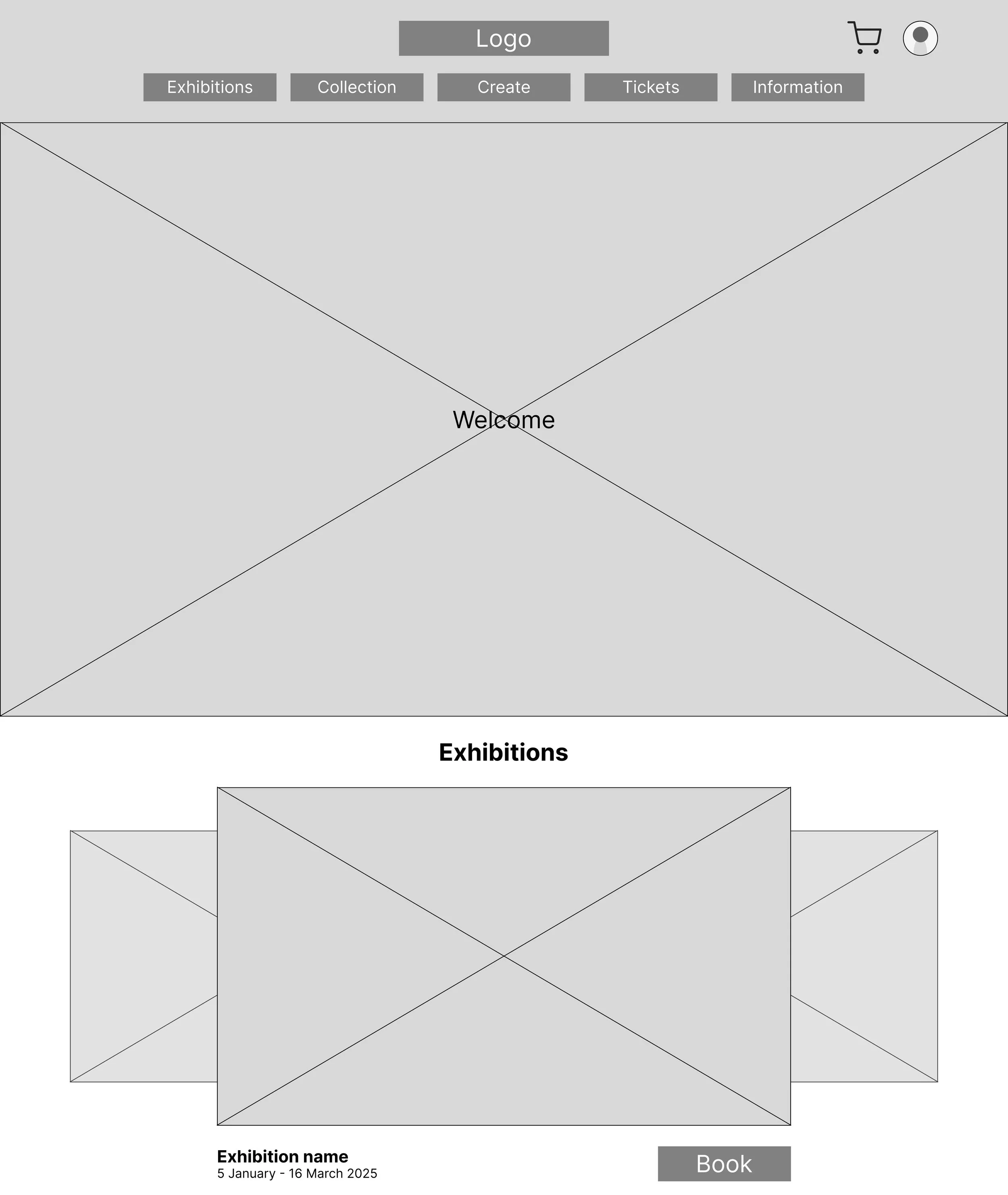
Carousel with current exhibitions on view
Randomised exhibition tool if user is not sure which exhibition to go to
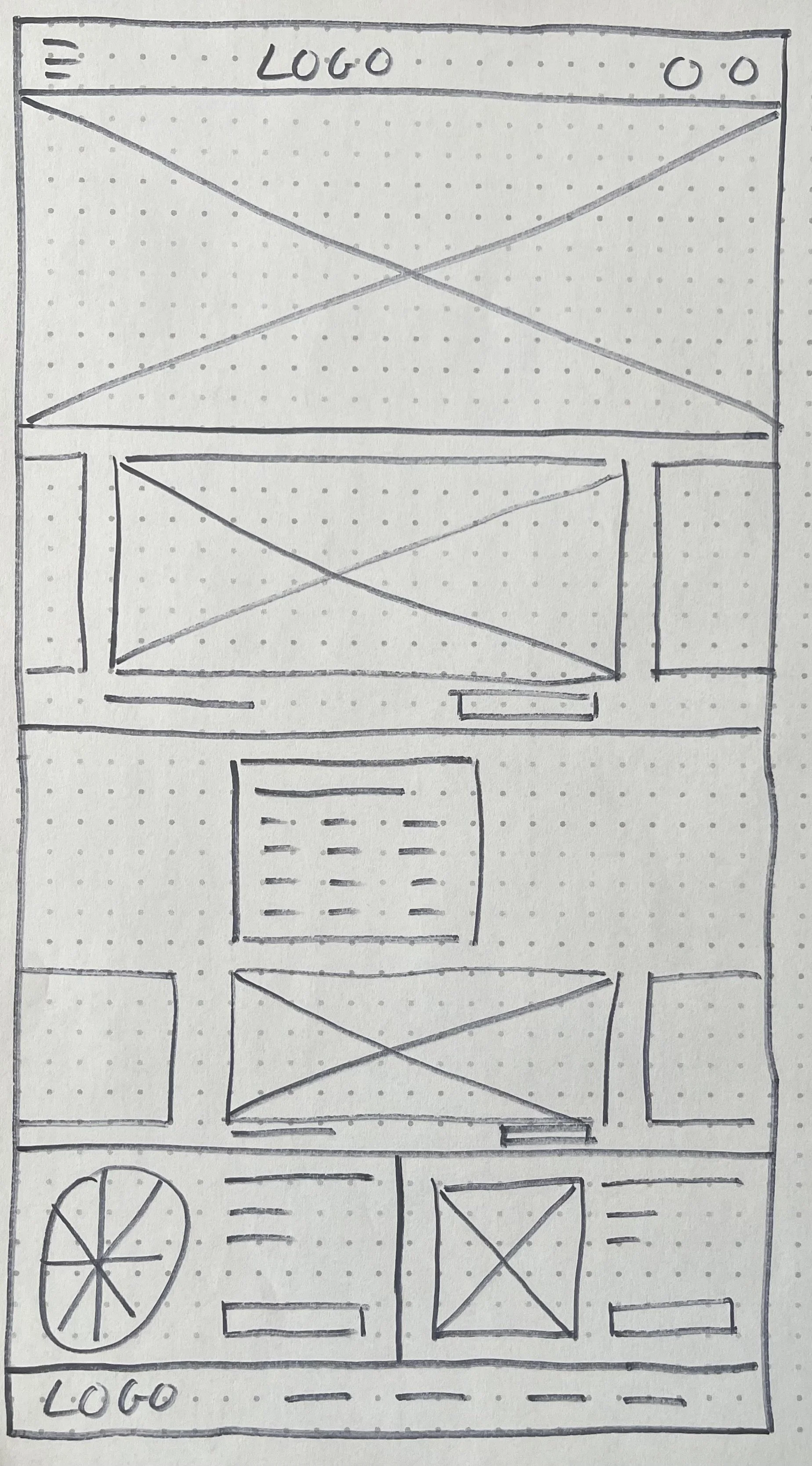
Digital wireframe screen size variations
To make sure the website would be fully responsive, I made digital wireframes for additional screen sizes (desktop, tablet and mobile).

Low fidelity prototype


I connected all the screens to create a low-fidelity prototype, keeping the main user flow in mind, to test functionality before incorporating it into the final design and to ensure the accessibility for users.
Usability study
Parameters
Study type:
Unmoderated usability study
Location:
The Netherlands & United Kingdom, remote
Participants:
5 participants
Length:
20-30 minutes
Findings
These were the main findings uncovered by the usability study and helped guide the designs from wireframes to mockups:
Exhibition overview
On the home page, users couldn’t easily find a way to navigate to the overview of current and upcoming exhibitions.
Checkout
Users had difficulty knowing at what step of the checkout process they were.
Home page
After opening the home page of the desktop prototype, users weren’t sure how to navigate through the home page.
Mockups
Before usability study
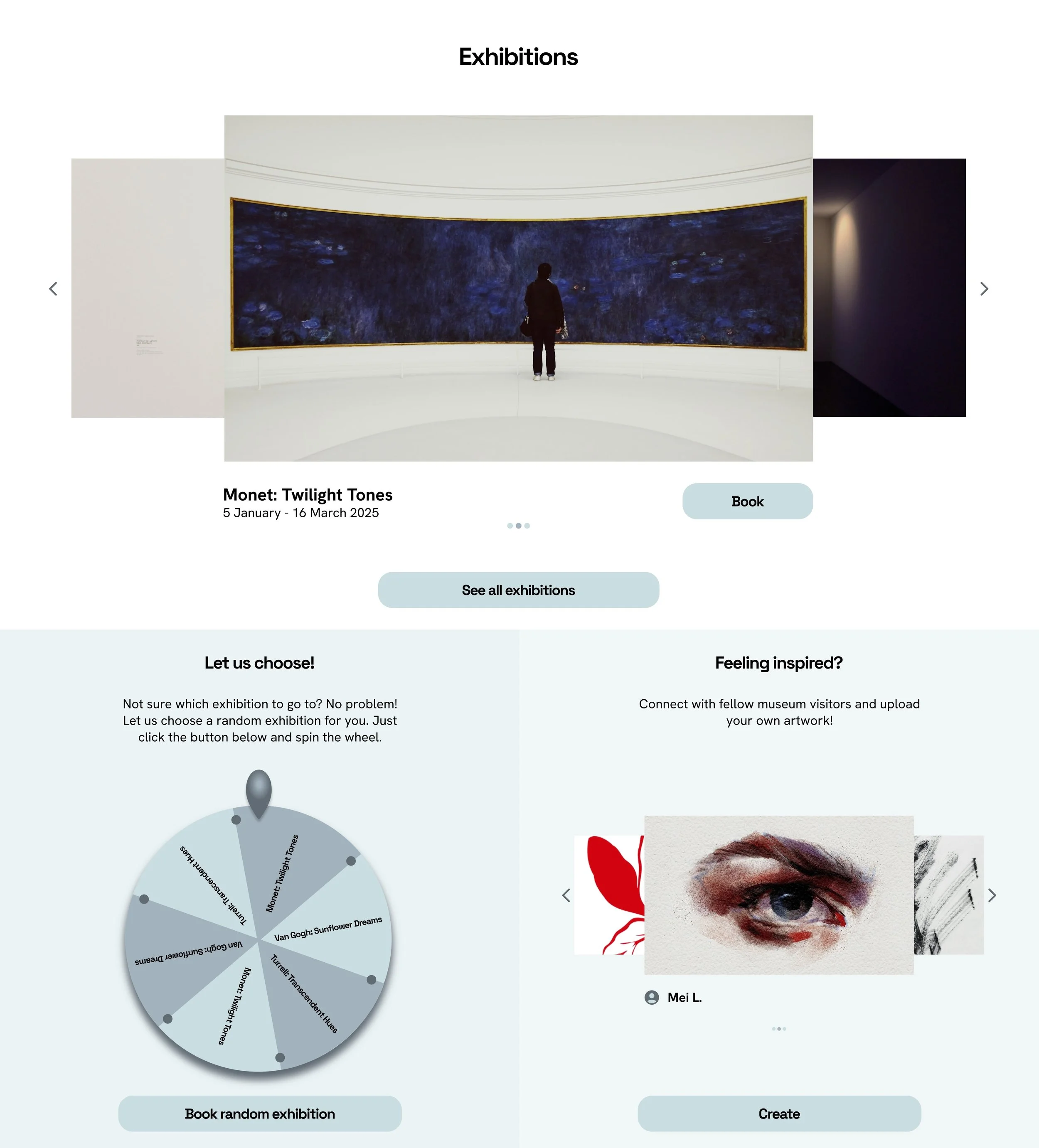
After usability study
Based on the insights from the usability study, I made changes to the home page and checkout screens, providing clear navigation cues and call-to-action buttons. One of the changes I made was to add a button to navigate to the overview of current and upcoming exhibitions.

Before usability study

After usability study
To make the checkout process clearer, I added a process tracker throughout the checkout screens.

Before usability study
After usability study
To make the home page clearer, I added icons and text with a clear call-to-action on the home page header.
Original screen size

Screen size variations
Tablet

Mobile


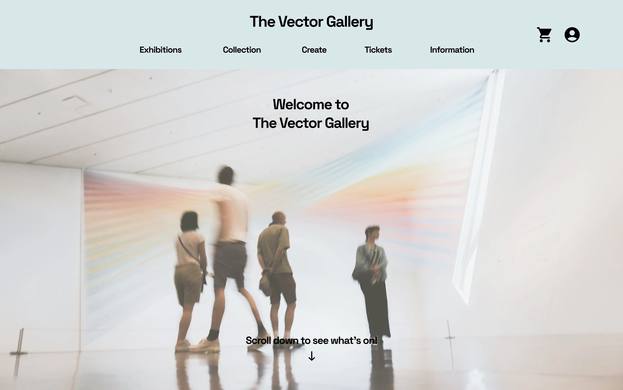
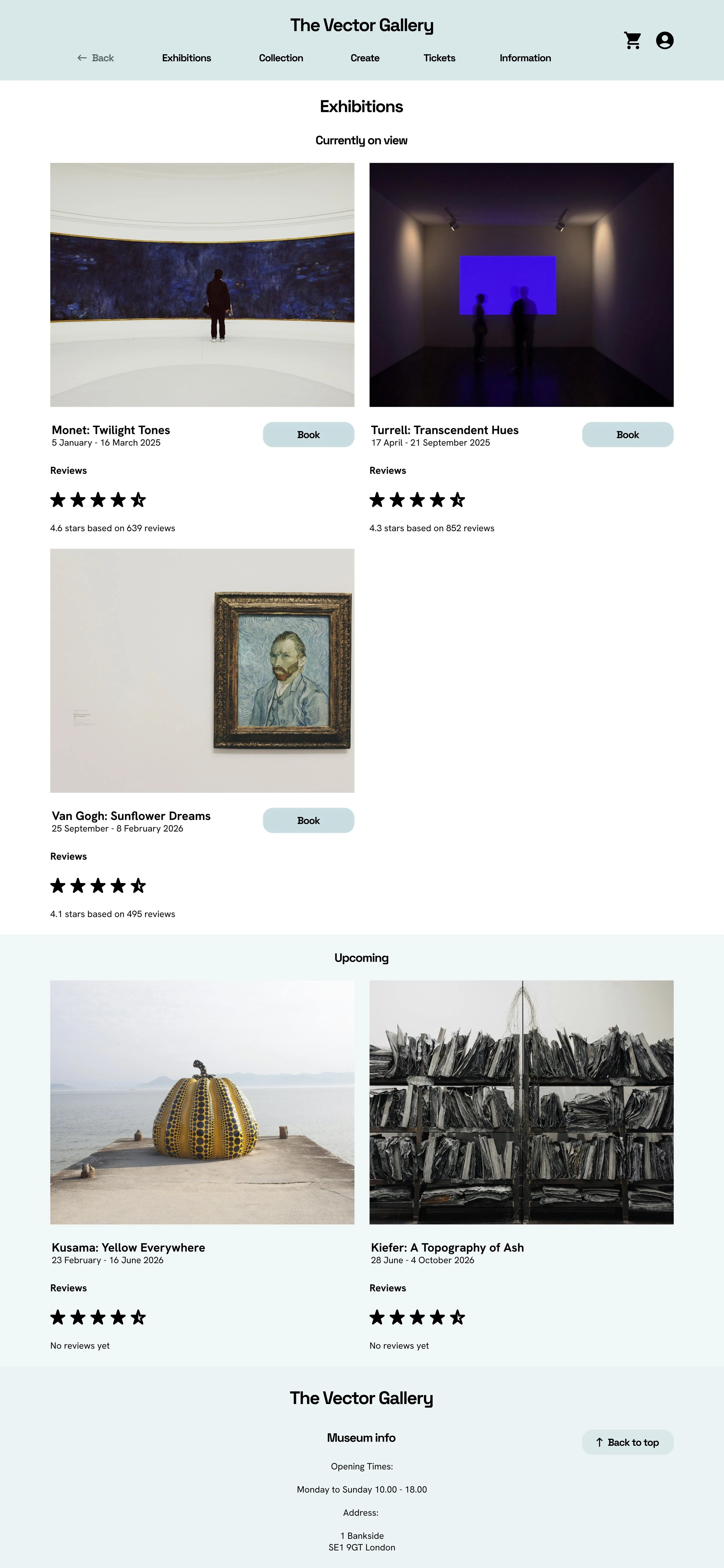
High fidelity prototype
The hi-fi prototype followed the same user flow as the lo-fi prototype. I made changes to the designs after the usability study for a better user experience, as well as making visual design choices involving colour, icons and typography.
Accessibility considerations
I made sure to have both a clear label and a related icon for all call-to-action buttons
I made sure - with an online contrast checker - the text and the background had enough contrast to be easily legible
I used the Gestalt principle to group similar items together. For example, I used a different background colour to group certain items together and to give visual cues they are different then other elements on the page
Takeaways
Impact
A quote from a user after using the website:
“I have never seen anything this creative in a museum website before…
This website has a lot of features I don’t necessarily expect a museum website to have. There’s a lot of extras that I really appreciate”
What I learned
I learned the process of creating a responsive website from start to finish as a UX designer. This project was completed as part of the Google UX Design course, and this was one of my first experiences with UX design. I learned how to conduct research, to empathise with users, to define and ideate ideas, create wireframes and mockups, create lo-fi and hi-fi prototypes and how to conducting usability studies and implement insights afterwards.
Next steps
Keep iterating on existing features to make improvements for users
Add a function to save favourite artworks from the museum collection
Add shopping feature with items from the physical museum shop