The Vector Gallery - mobile app
Project overview
The product
I’ve created an app to help people, who are not very familiar with the art world, to choose what exhibition they want to go to and let them easily book tickets.
Project duration
November 2024 - March 2025
The problem
Visitors of The Vector Gallery find it hard to find and decide what exhibition they want to go to.
The goal
The Vector Gallery app will let users choose and book tickets to an exhibition to go to for users who aren’t familiar with the art world.
My role
Solo UX Designer (end-to-end)
Responsibilities
I conducted user research, made wireframes, made mockups, made lo-fi and hi-fi prototypes and conducted usability studies for user testing to ensure seamless implementation of the final design.
User research
Summary
I interviewed users about their experience finding an exhibition to go to, and buying tickets on a museum website. I also asked how users decide what exhibition to go to and the main reason why they go to exhibitions. It was useful getting to know how users like to express their creativity.
Assumptions I made going into the research were that it is easy to decide what exhibition to go to, for example because of recommendations of friends. This assumption changed after conducting the research, as not every user has as much knowledge of art. It showed me how users might need help choosing what exhibition they would like to go to and that it can be overwhelming to go through a museum website not knowing what to look for.
Pain points
There is too much information on current museum websites, which makes it hard to find what exhibitions are currently showing. A clear overview with concise text is important to guide the design moving forward.
Some users with limited knowledge of art find it hard to decide what exhibition to go to. A tool to help users decide what exhibition to go to is important to guide the design moving forward.
Users who are not technologically savvy find it hard to use the online ticket booking system and do not know how to get discounts. An easy online ticket booking system is important to guide the design moving forward.
It is difficult to find what date an event is, that the museum is holding, and if they will happen again. A clear calendar with events is important to guide the design moving forward.
Hard to decide what exhibition to go to
No clear overview of current exhibitions
Difficult to find what date events are
Hard to book tickets online
Persona
Leah Sato
Leah is a receptionist at a bank who needs an easy app to decide what exhibition she wants to go to because she isn’t familiar with the art world and wants to learn more about art.
Age: 32
Education: high school and college graduate
Hometown: Tokyo, Japan
Family: single, lives alone
Occupation: receptionist at a bank

“Creativity and art give me the opportunity to dream”
Goals
to learn more about art
to find a way to use more of her creativity
to spend more time with friends and family
to get inspired and start drawing
Frustrations
can’t decide which exhibition she would like to go to
too much information on existing websites
she has limited time to spend on the weekend
Leah is a receptionist at a bank, she works 5 days a week and only has the weekend to see her friends and family and plan activities. Leah is interested in art and would like to learn more about it. She finds it hard to navigate a museum website and decide what exhibition to go to as there is too much information on the website. She would like to use more of her creativity and get inspired to potentially start drawing.
User journey map
Leah’s user journey showed me the flow a user might go through to decide what exhibition to go to and helped me pin point the benefits of creating an app with a clear overview of exhibitions and an easy way to buy tickets, for a user who hasn’t gone to museums often.
Persona:
Leah Sato

Easily find an exhibition to go to and buy tickets so that she can spend time with friends and family and get inspired to start a new hobby
Goal:
Wireframes
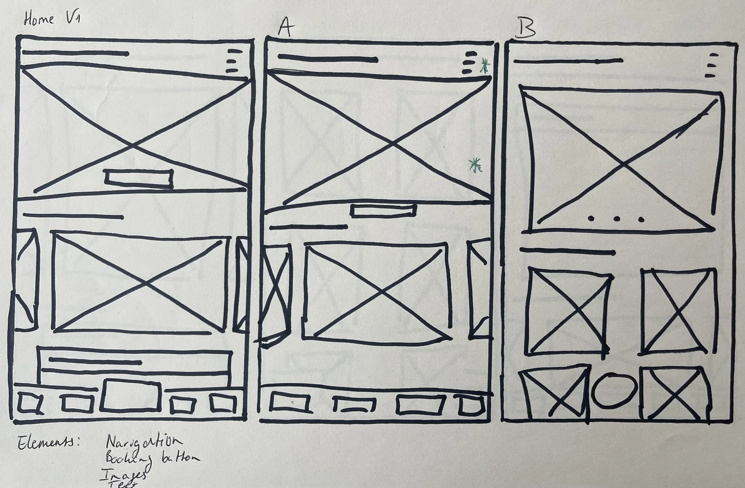
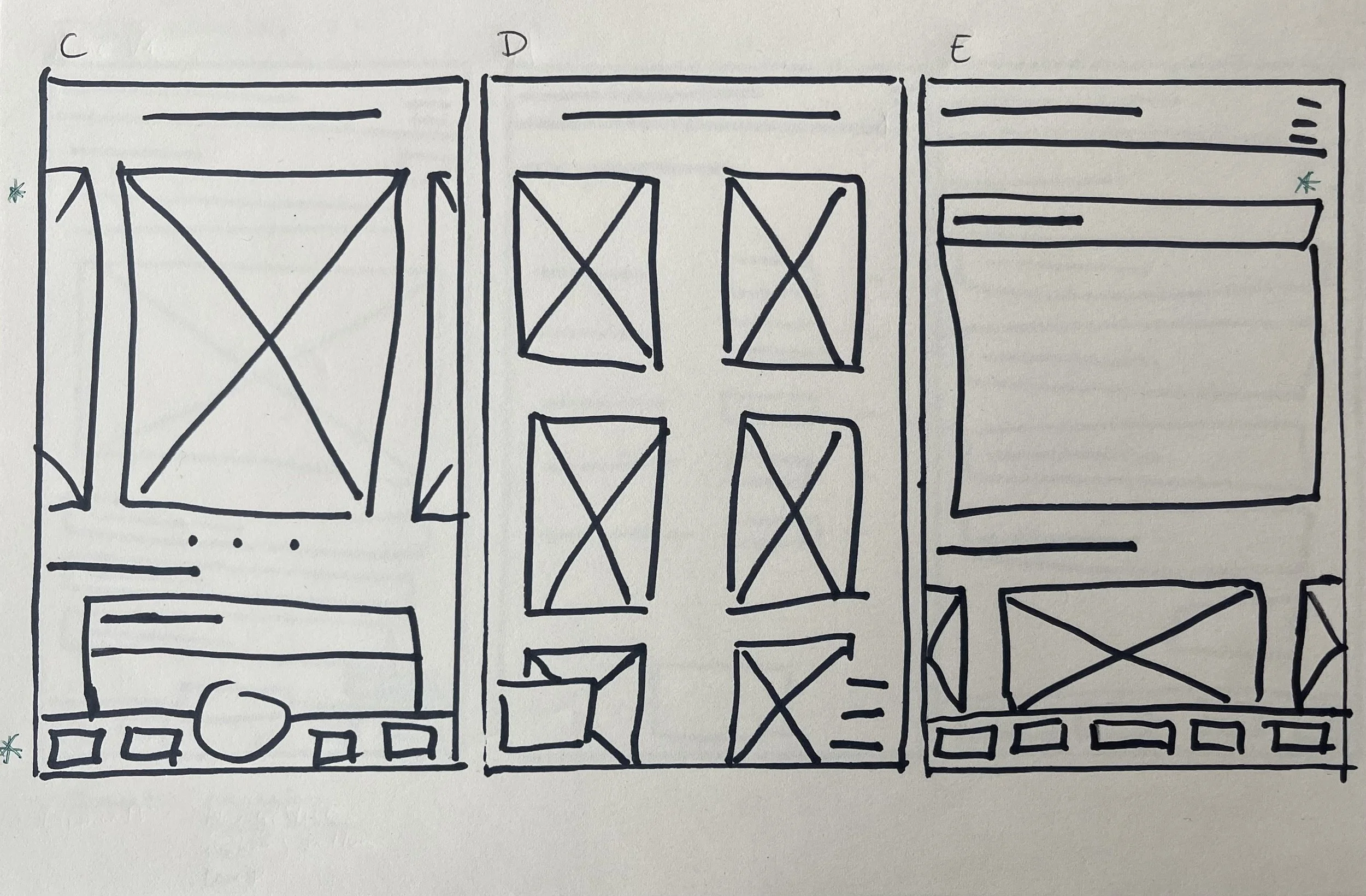
Paper wireframes
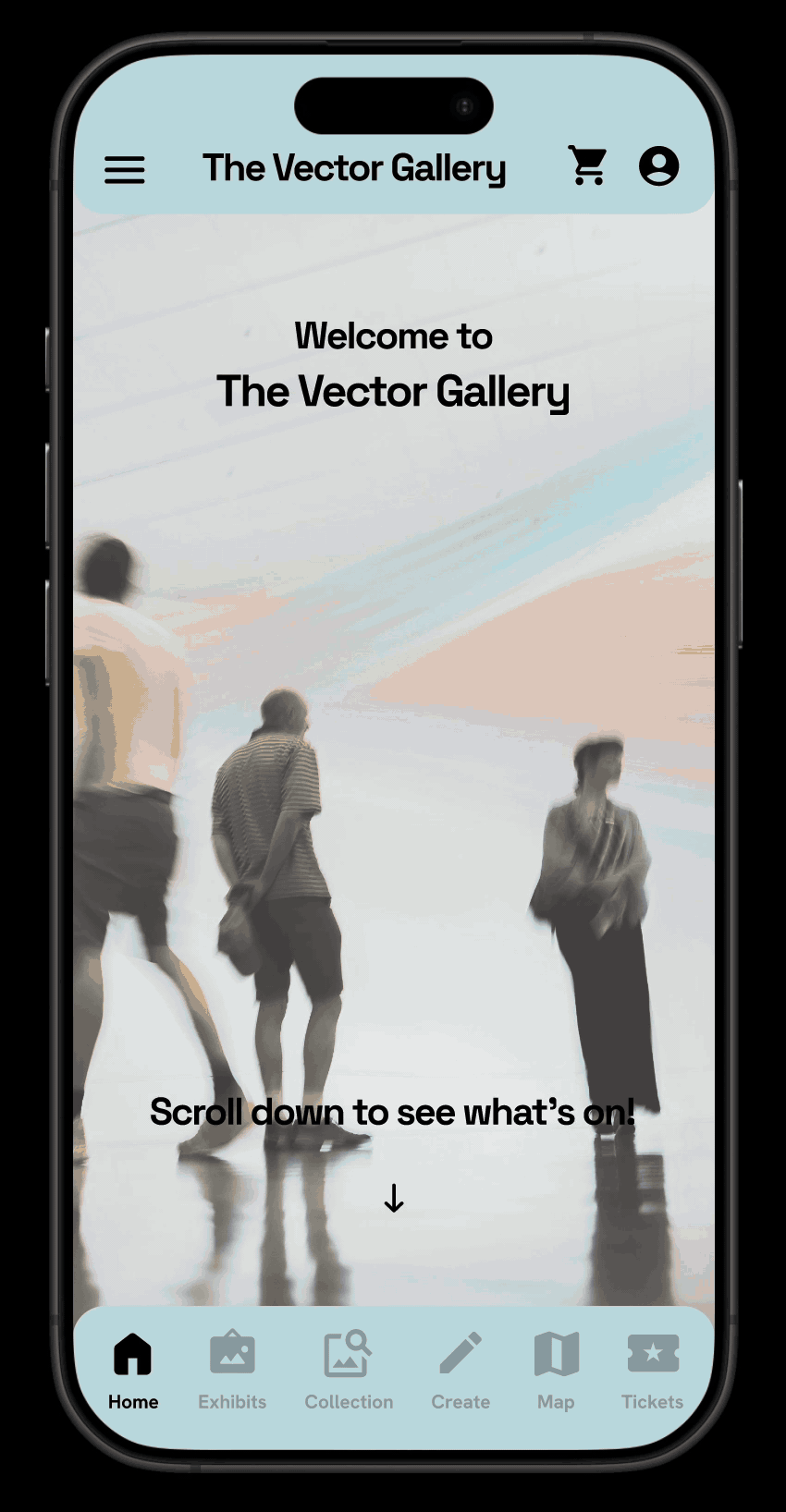
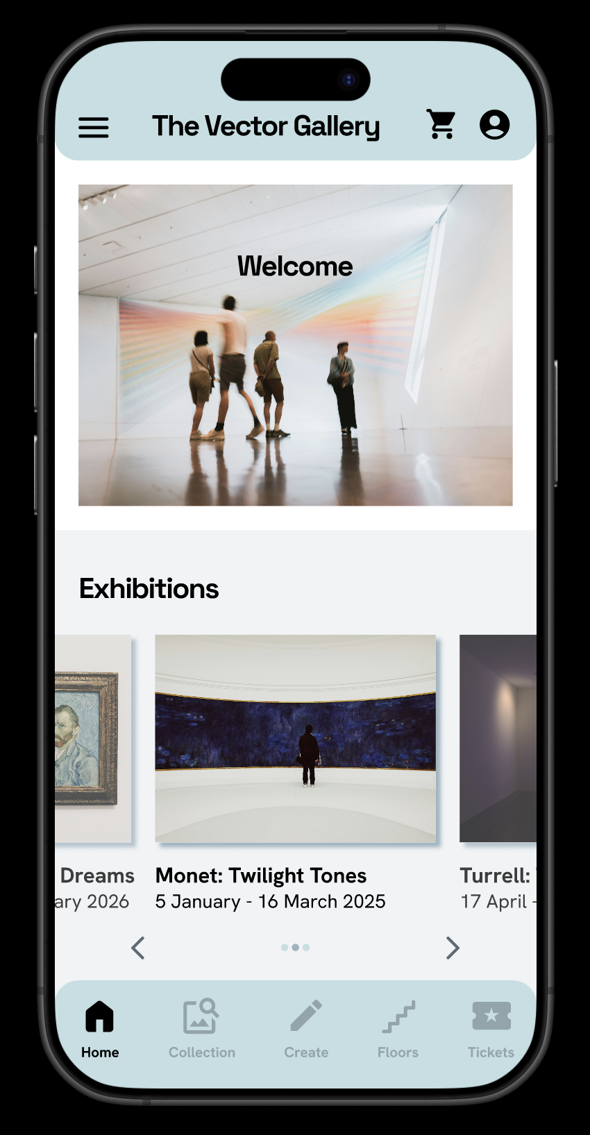
Through paper wireframes I ensured that the elements needed to address user pain points were made clear to continue to digital wireframes. For the home screen, I prioritised a quick and easy overview of current exhibitions and events, plus a clear booking button to buy tickets easily.
Digital wireframes
To continue the initial design phase, I made sure that the elements used in the screen designs/digital wireframes address user pain points. For example, an easy overview of current exhibitions.
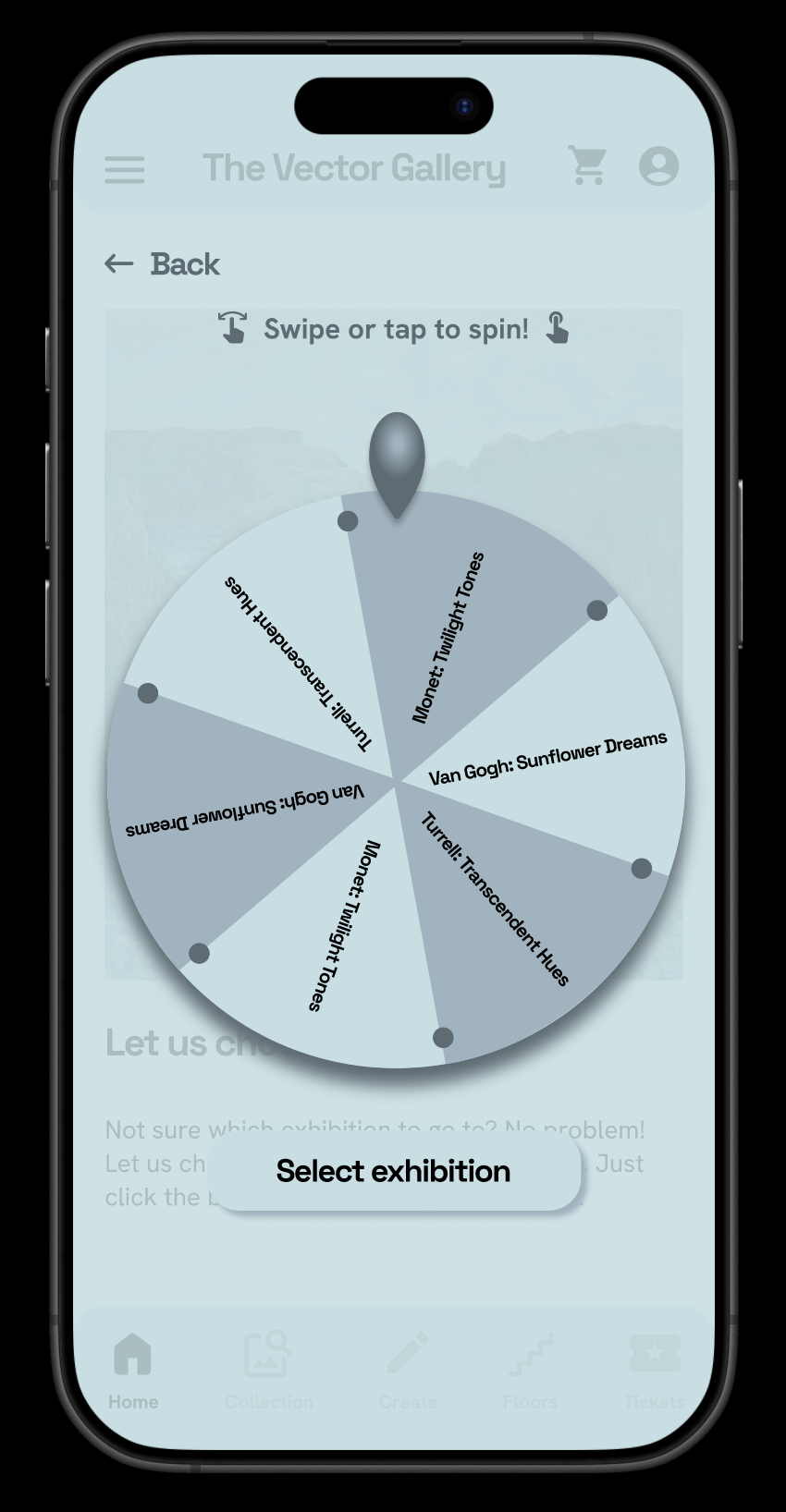
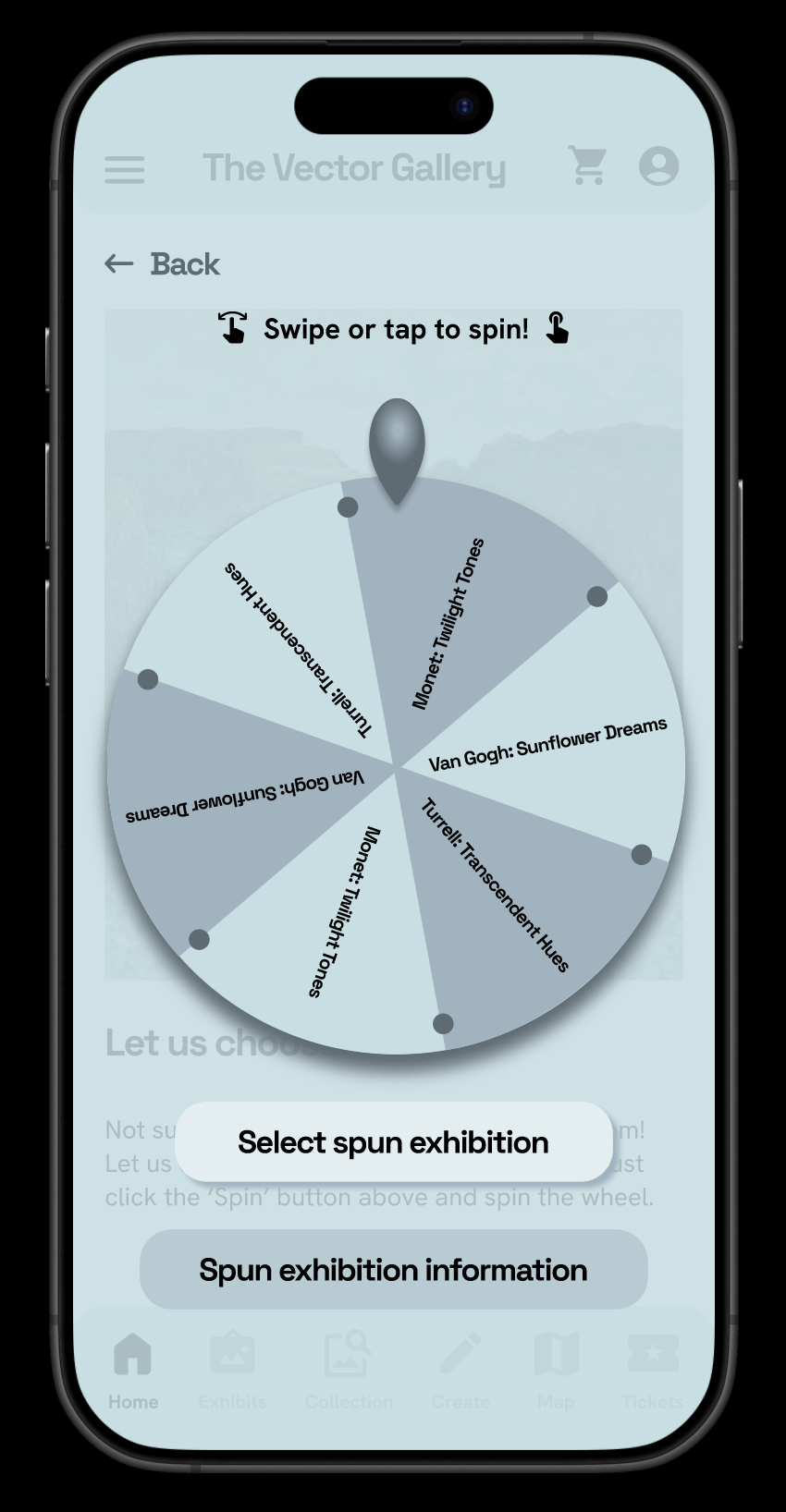
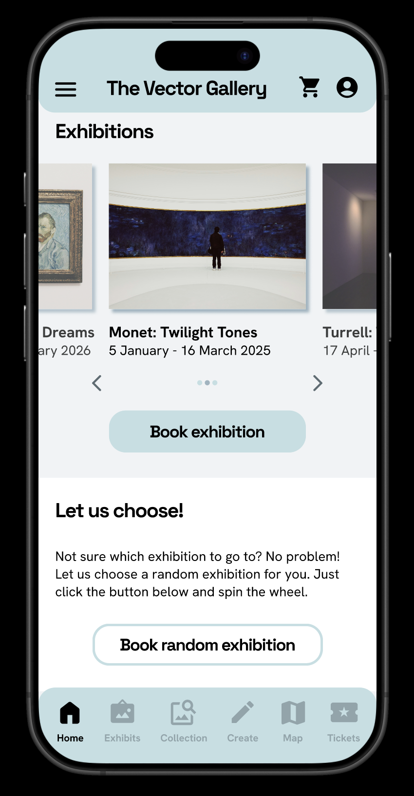
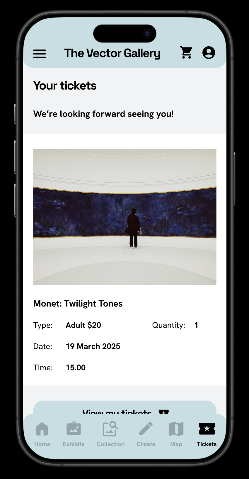
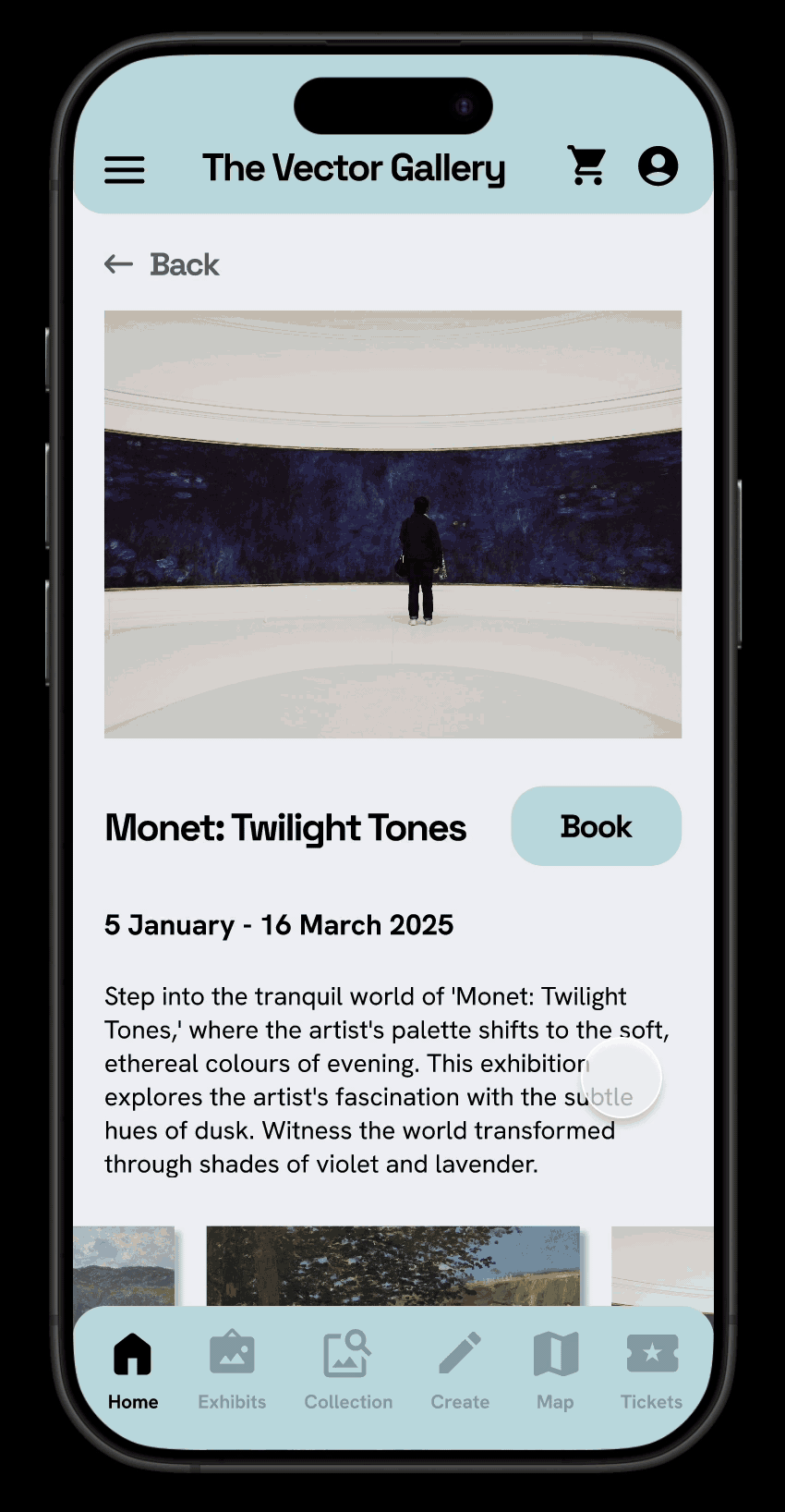
A key user need was to be able to choose exhibitions easily. Besides the randomised exhibition tool on the previous page, the review tool on the exhibition page here will help users decide if it’s worth going to a certain exhibition based on people that already went.

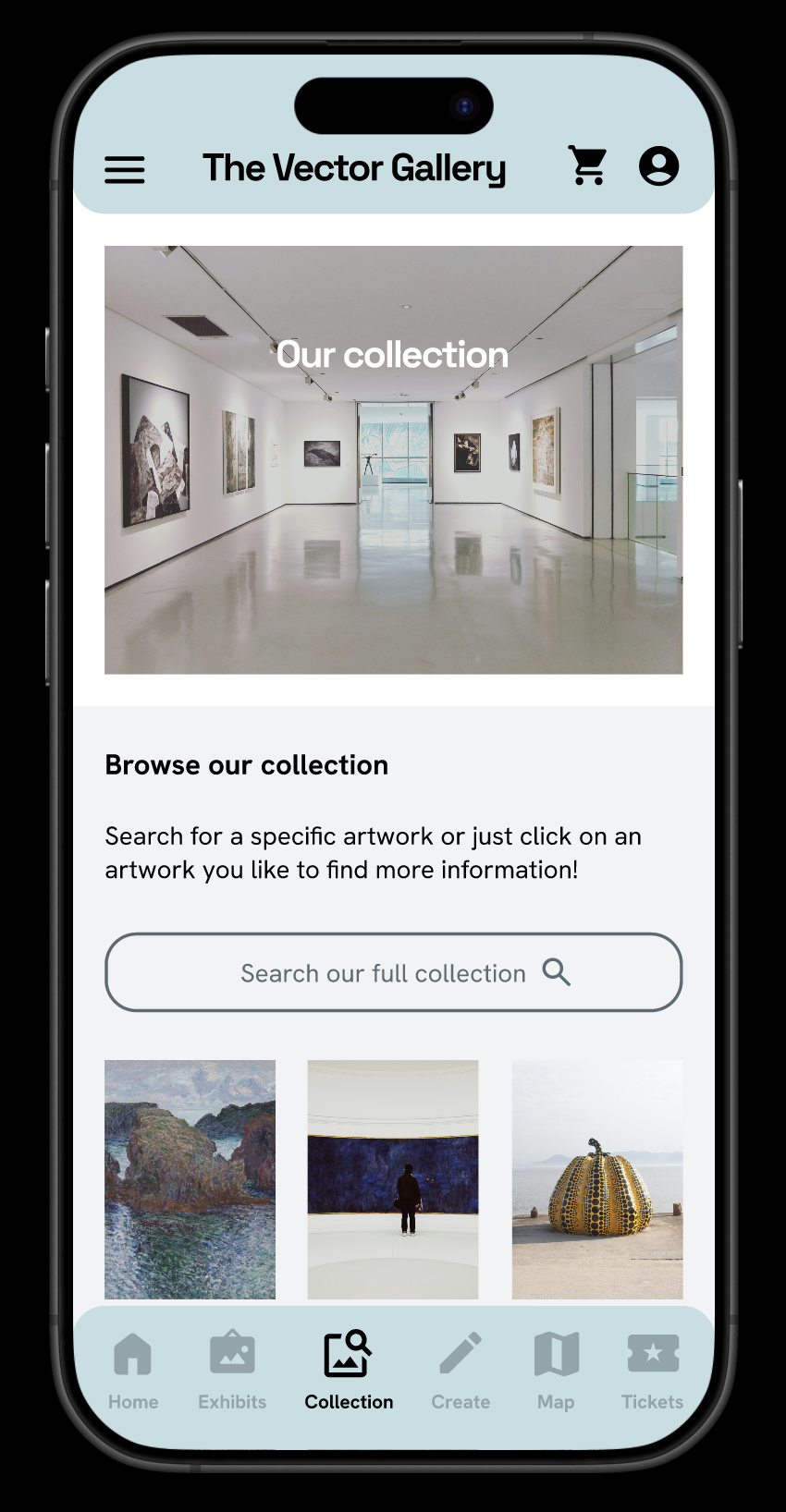
Easy to scroll through current exhibitions
Randomised exhibition tool if user does not know which exhibition to see

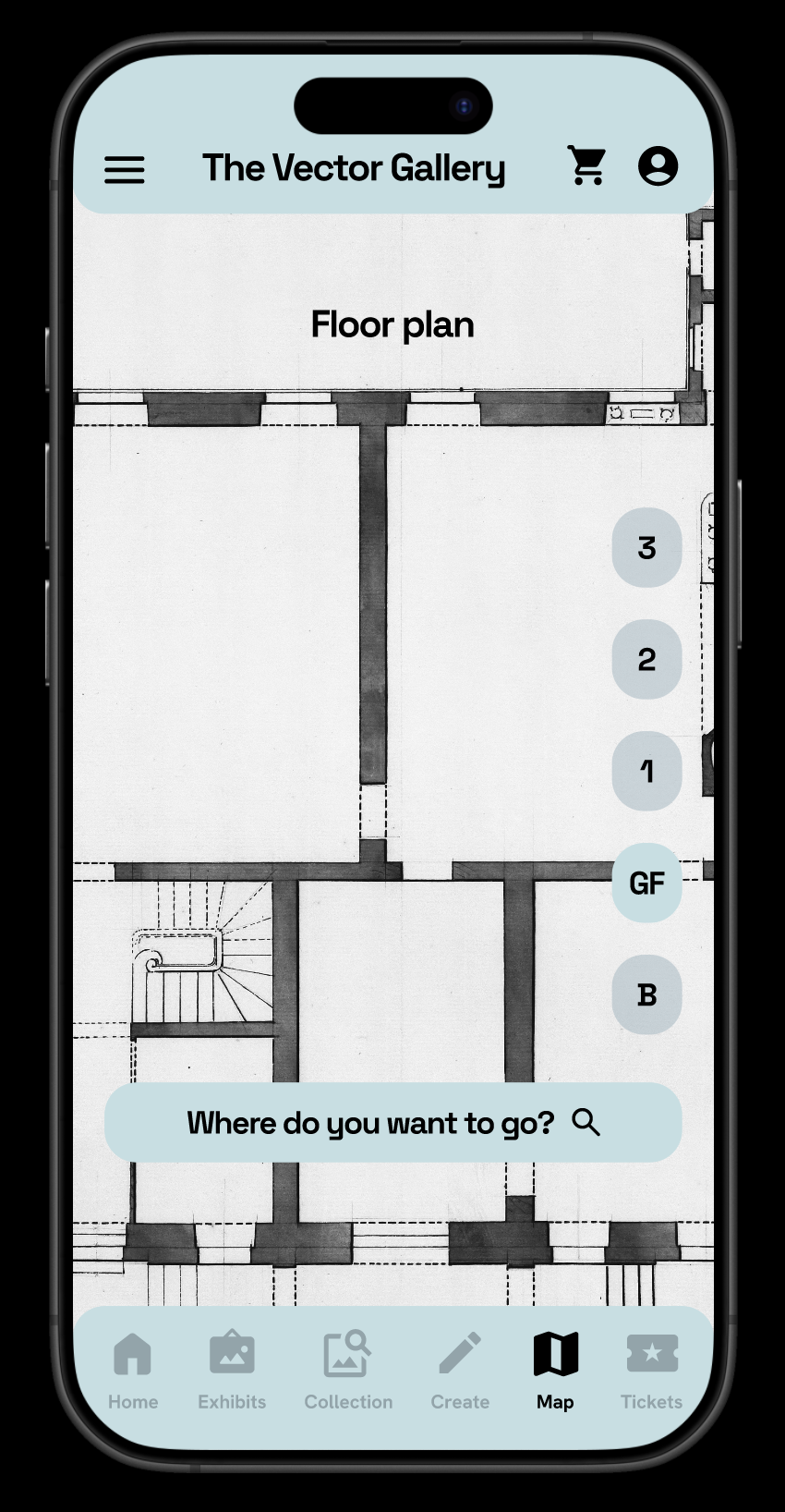
Calendar with events linked to specific exhibition
Reviews of exhibitions to help users decide if they want to go to the exhibition
Low fidelity prototype
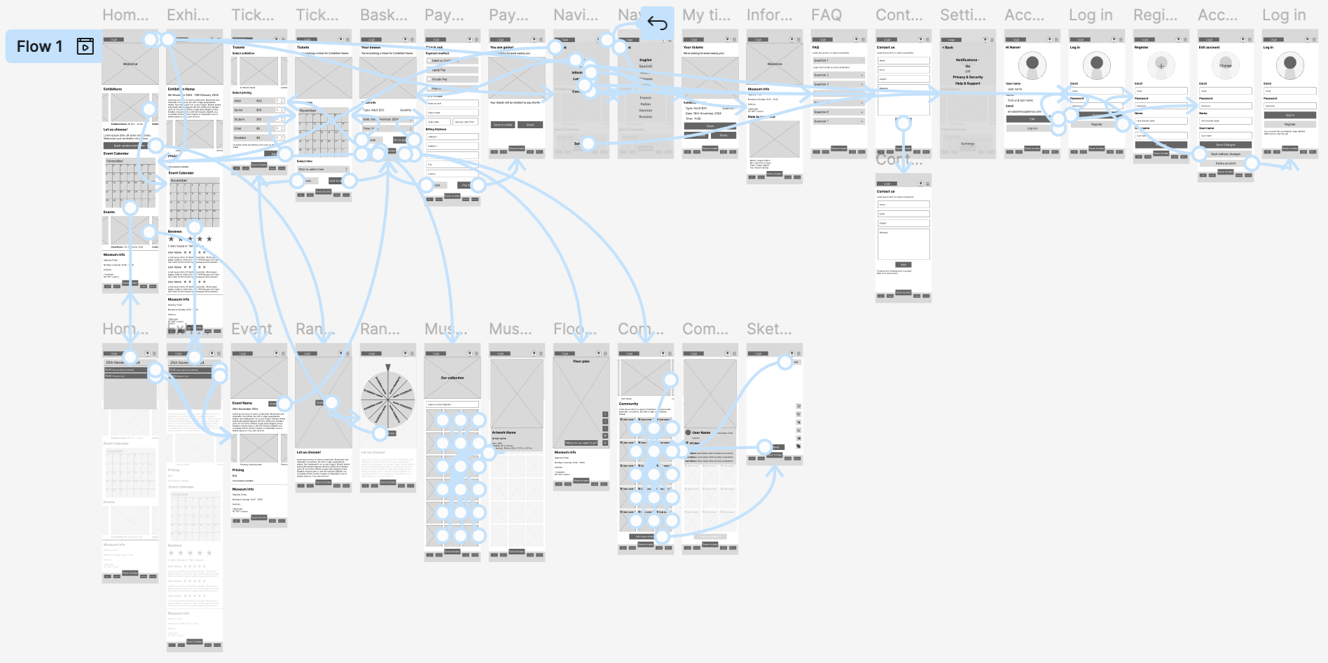
The user flow makes sure that the user can easily choose their exhibition, buy and select their tickets and view their tickets if they log into their account
Click here to test the low fidelity prototype
Usability study
Findings
I conducted two rounds of usability studies. Findings from the first study, using a low-fidelity prototype, helped guide the designs from wireframes to mockups. The second study used a high-fidelity prototype and revealed what aspects of the mockups needed refining.
Round 1 findings
Users need clearer call to action buttons on home and exhibition pages
Users need more information on what “Book random exhibition” means
Users need better cues to find their tickets in the app
Round 2 findings
Users need a menu button and page with overview of current exhibitions on view
Users need the ‘Swipe or tap to spin’ text to be marked clearer for the random exhibition spinner
Users need a clearer way to find the exhibition reviews
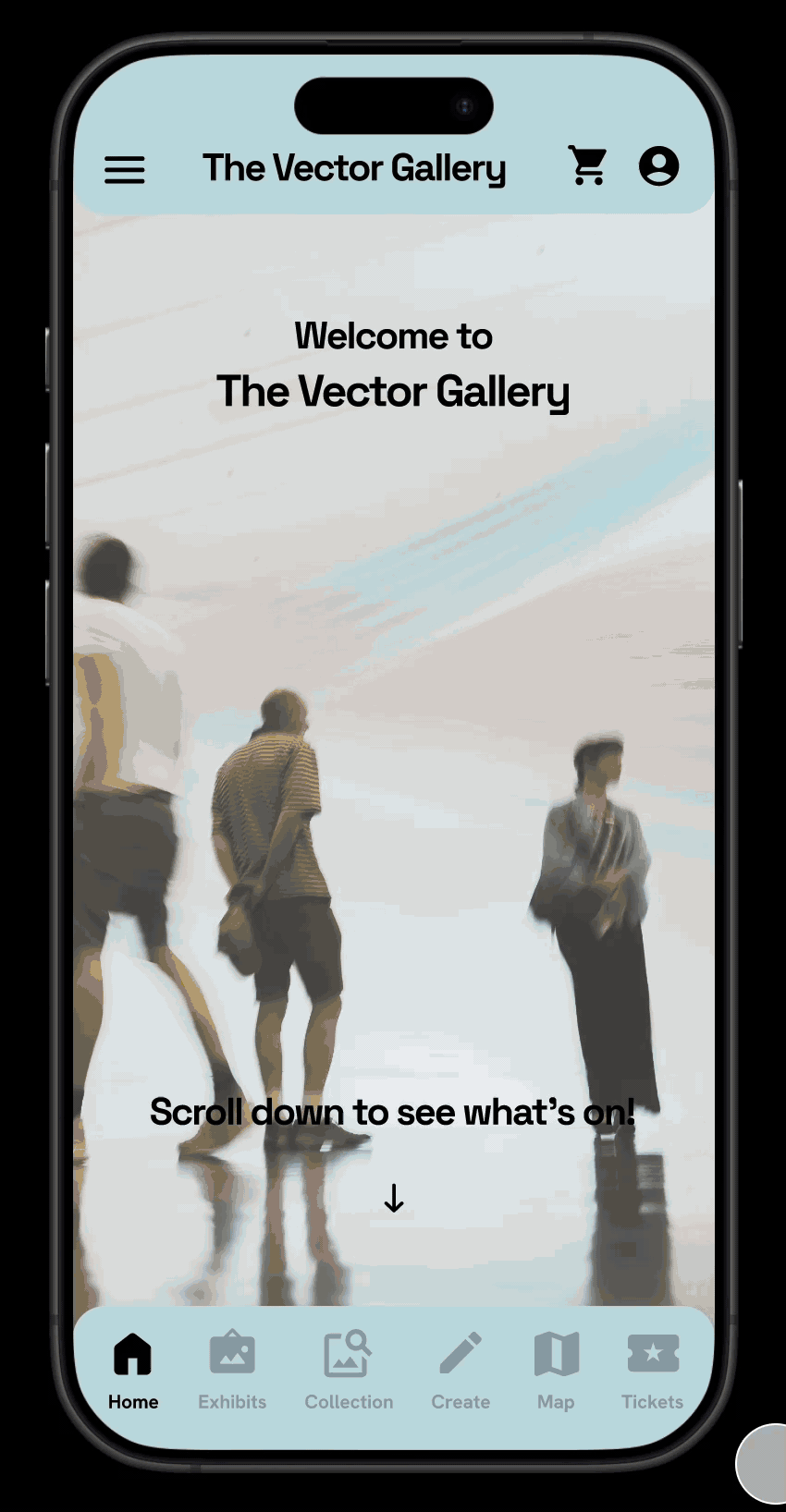
Mockups
Before usability study


After usability study
The second usability study revealed that a menu button and page with overview of current exhibitions on view was missing. It was also revealed that the home page wasn’t as attention grabbing on initial view and the review feature of exhibitions wasn’t noticeable. I added a ‘Exhibits’ tab in the bottom navigation bar, made a page showing current exhibitions including ‘Book’ buttons and reviews and changed the home page to be more attention grabbing.
Before usability study
After usability study
The second usability study also revealed that the ‘Swipe or tap to spin’ text should be marked clearer for the random exhibition spinner. Besides that, it was revealed that there needed to be a way to read more information about the spun exhibition. I made the ‘Swipe or tap to spin’ text darker and added a ‘Spun exhibition information’ button underneath the spinning wheel.


Accessibility considerations
I made sure to have both a clear label and a related icon for all call-to-action buttons
I made sure - with an online contrast checker - the text and the background had enough contrast to be easily legible
I added a translation setting, so the app can be translated and used in different languages
I made sure that there are ways to turn on or off certain features, like motion and sound
Takeaways
Impact
A quote from a user after using the app:
“I have never seen anything this creative in a museum app before…
This app has a lot of features I don’t necessarily expect a museum app to have. There’s a lot of extras that I really appreciate”
What I learned
I learned the process of creating a project from start to finish as a UX designer. This project was completed as part of the Google UX Design course, and this was my first experience with UX design. I learned how to conduct research, to empathise with users, to define and ideate ideas, create wireframes and mockups, create lo-fi and hi-fi prototypes and how to conducting usability studies and implement insights afterwards.
Next steps
Keep iterating on existing features to make improvements for users.
Add a function to save favourite artworks from the museum collection.
Add a feature to be able to scan artworks inside the museum to see information about the artwork through the app.
Add shopping feature with items from the physical museum shop.