The Vector Gallery - responsive website

Project overview
The product
NibbleNauts is a responsive website designed to help kids aged 7–14 learn how to cook healthy food through interactive lessons, playful visuals, and badge-based progress.
Project duration
May 2025 - May 2025
The problem
Kids would like to cook healthy meals that also taste good, because they want to feel independent and grown-up.
The goal
Just like our NibbleNauts app, this website will let users learn how to cook healthy meals, by giving them ingredients and instructions to cook a healthy meal in a fun and engaging way.
My role
Solo UX Designer (end-to-end)
Responsibilities
I conducted user research and defined user needs, the problem and provided insights to inform the ideation phase. I conducted a competitive audit and summarised my findings in a competitive audit report. I created personas, user journeys, empathy maps, user flows and a sitemap. I made wireframes and mockups. Created a design system, and lo-fi and hi-fi prototypes. Focused on visual design, usability and accessibility. Conducted a usability study for user testing and iterated on the feedback.
User research
Summary
I used the same research I conducted and pain points I defined for the NibbleNauts app to create a responsive website version.
To understand the needs of the user better, I conducted informal interviews with kids aged 7-14. The goal was to understand and gain insights in what the kids want and need from a cooking website, so that I can design a useful website that tackles the user’s needs. I focused on the biggest challenges the kids face, what could make them continue using the website, and how they can improve their skills in a fun and intuitive way.
Secondarily, I also informally interviewed some of their parents and/or guardians, as they are an indirect user of the website as well. This way I could understand their needs and pain points too, to make sure they feel like their kids can use the website, and cook, safely.
Pain points
Kids have difficulty reading long or complex instructions with current recipes to help them cook. This makes them loose interest and self esteem as it seems hard to make.
Safety concerns
Kids learn at school, so when they are home they don’t want overly educational content. This gets them bored and cooking is not fun for them anymore. Parents and/or guardians also struggle teaching healthy cooking in a fun way.
Ingredients
Parents and/or guardians are concerned about their kids safety regarding the use of knives and heat. Kids have limited knife and stove skills that raises concerns in their ability to make a recipe.
Kids get frustrated when they see or make recipes that require hard-to-find ingredients. Parents and/or guardians also have limited knowledge on how to teach cooking with healthy ingredients.
Overly educational
Complex instructions
Persona
Jayden Carter
Jayden is a 7th grader and big brother who needs an app to learn how to cook healthy meals that also taste good, because he wants to help his mom make dinner and improve his cooking skills.
Age: 13
Education: 7th grade
Hometown: Milwaukee, Wisconsin
Family: lives with his mom and little sister (6)
Occupation: middle schooler & big brother

“I want to cook something actually good for once — like real meals, not just cereal.”
Goals
learn how to make meals that are healthy but also taste good
help his mom out by making dinner once a week
track his cooking progress and feel like he’s improving
Frustrations
Jayden’s been asking his mom if he can cook once a week to help out — plus he likes the idea of getting stronger and eating better. He’s tried a couple recipe websites but gets overwhelmed with all the steps and unfamiliar words. He needs something that doesn’t make him feel like a little kid, but still helps guide him with clear, visual instructions. A fun app with a progress tracker, cooking skills to unlock, and simple nutritional tips would help him feel empowered — not embarrassed — to keep learning.
doesn’t always know which ingredients are healthy or not
finds kid apps too “baby-ish” or boring
gets discouraged if a recipe doesn’t turn out right
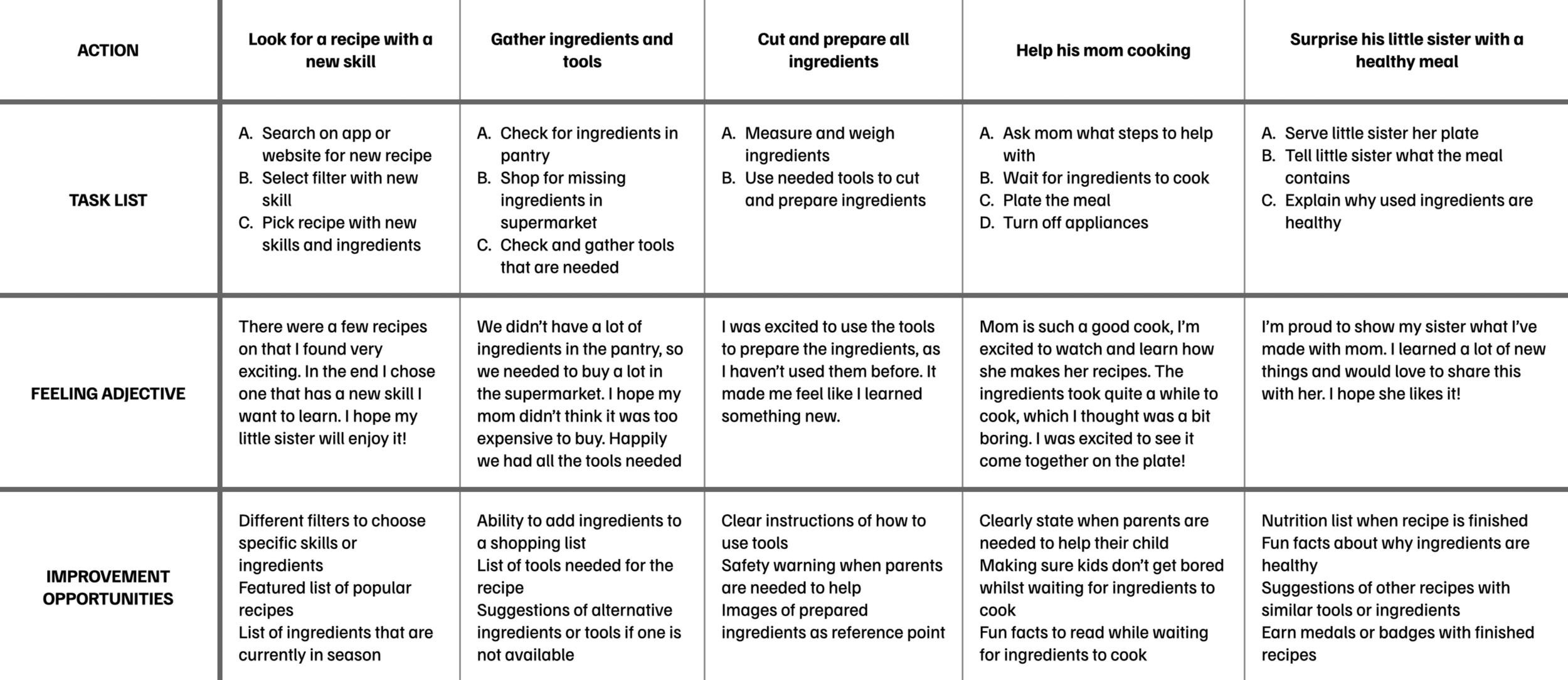
User journey map
I created Jayden’s user journey map to help identify possible pain points and improvement opportunities for the website. It illustrates the process of how Jayden behaves, feels and thinks whilst completing his goal to help his mom cook.
Persona:
Jayden Carter
Learn how to make meals that are healthy but also taste good so that he can help his mom out making dinner and improve his cooking skills
Goal:
Competitive audit
I conducted a competitive audit with direct and indirect competitors, to get an idea of existing platforms on the market and to identify opportunities to better solve the user’s pain points and needs. I discovered these key findings that helped me iterate ideas for the designs:
Lack of structured learning journeys
Healthy eating is often an afterthought
Interfaces are often too complex or too basic
Existing tools are either too simplistic or too complex for younger kids to navigate on their own.
Opportunity: Design a UI that balances simplicity, playfulness, and usability — ideally with features like large buttons.
While many platforms include recipes, very few centre their experience around healthy food choices for kids in an engaging, age-appropriate way.
None of the current platforms offer a structured, step-by-step learning path tailored to children learning to cook — especially one that scaffolds skills or celebrates progress.
Opportunity: Position the app as “where fun meets healthy”, with recipes that are both nutritious and exciting for kids to try.
Opportunity: Create an interactive journey where kids can level up their cooking skills and unlock new recipes or badges.
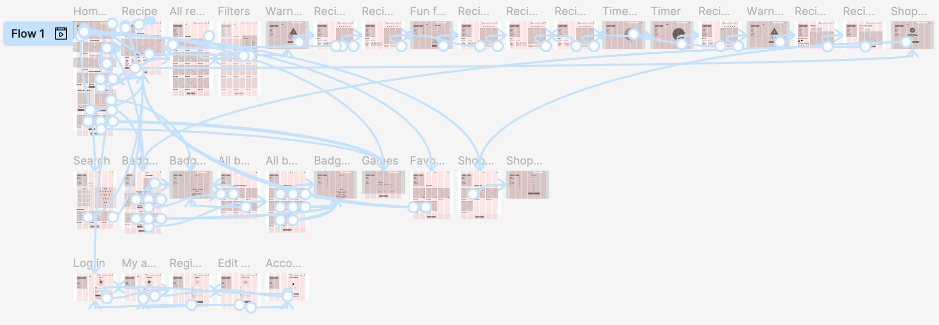
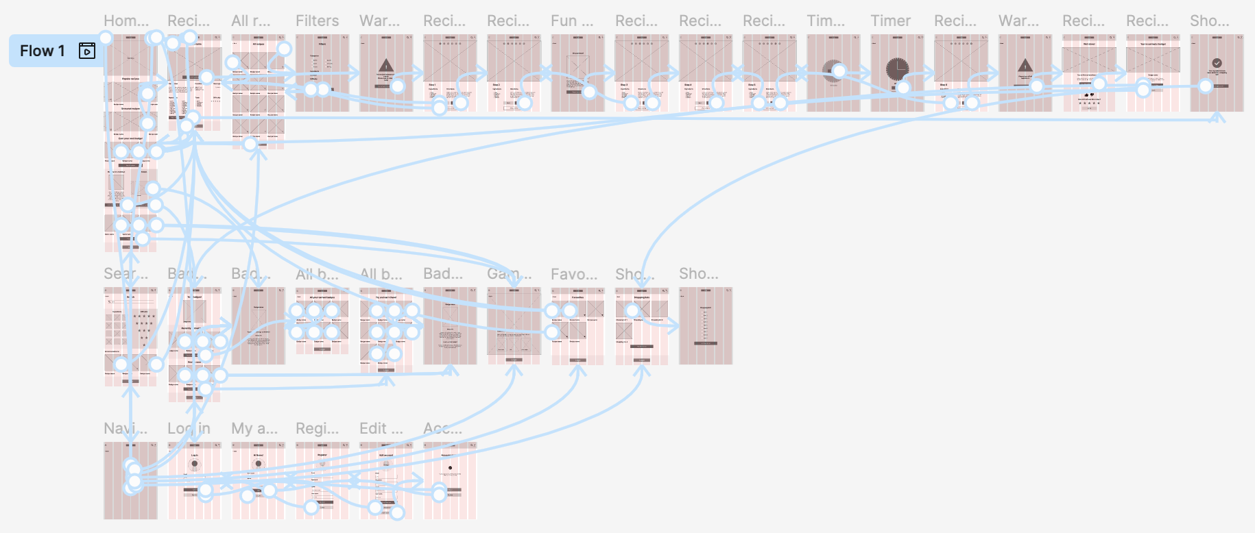
Sitemap
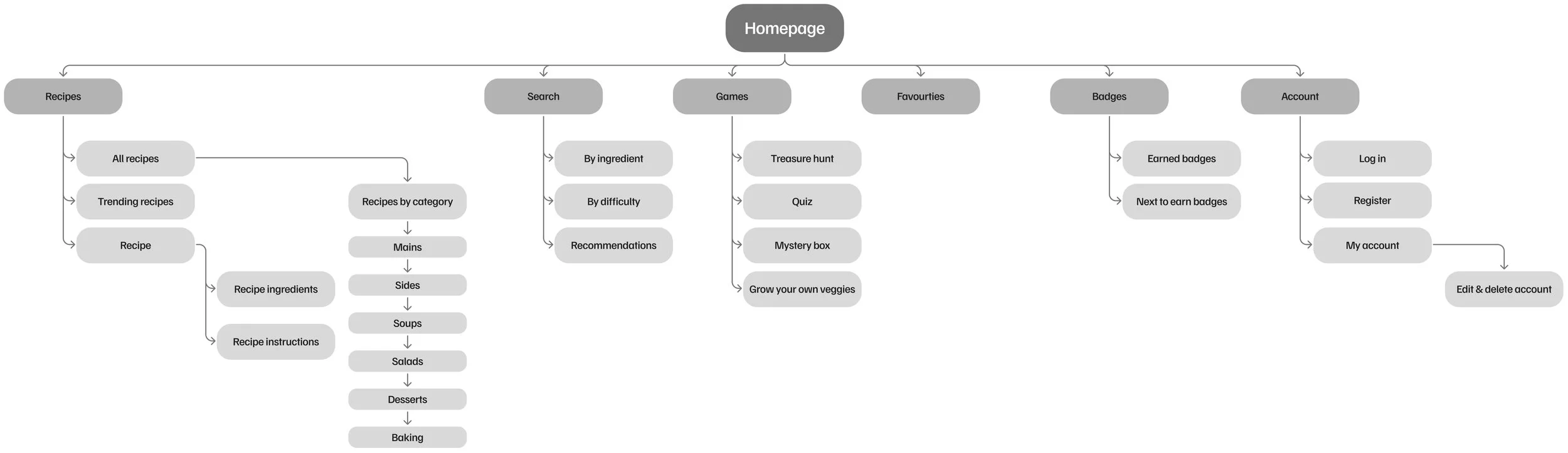
I built a user-focused sitemap to ensure that users can successfully complete their key objectives. My goal was to make strategic information architecture decisions that would simplify user flow and make core actions quick and intuitive.
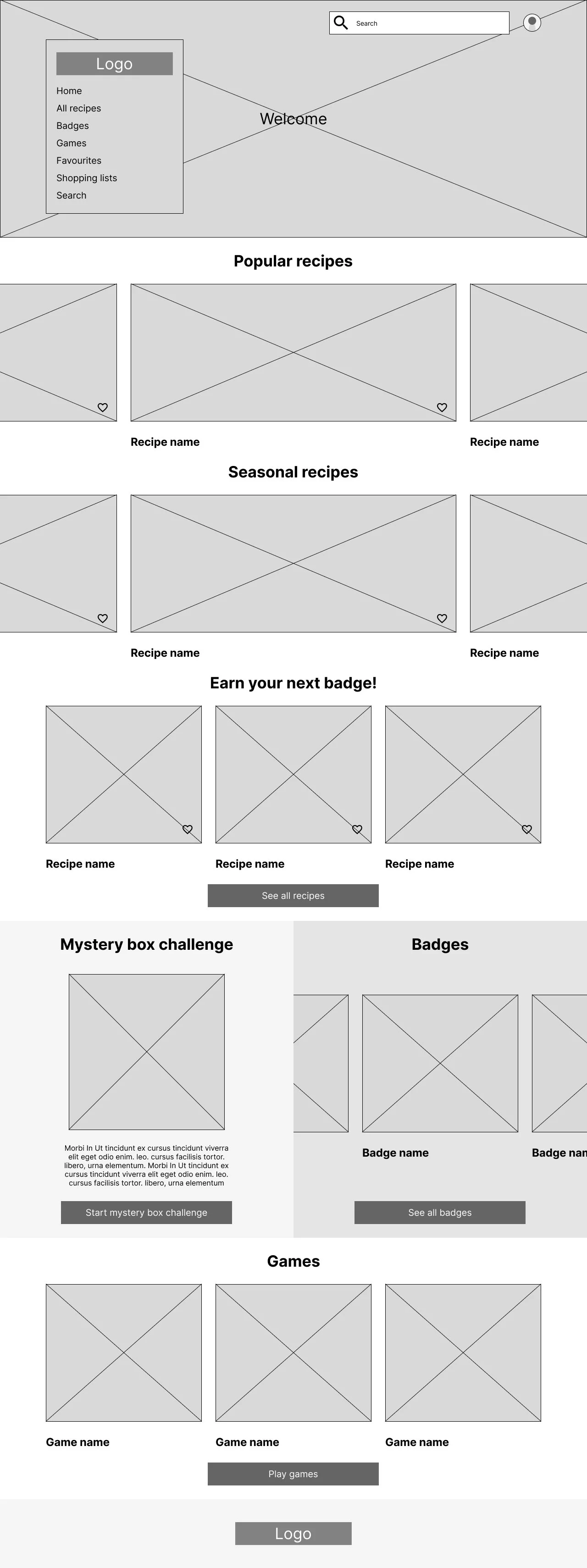
Wireframes
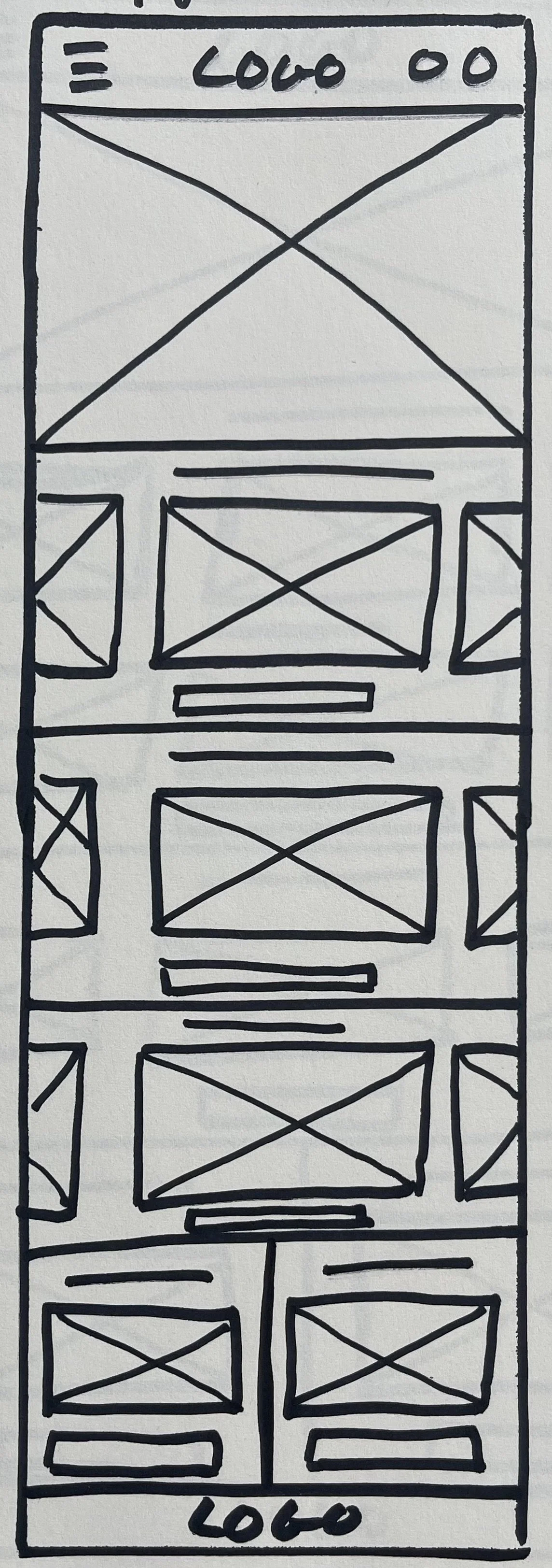
Paper wireframes
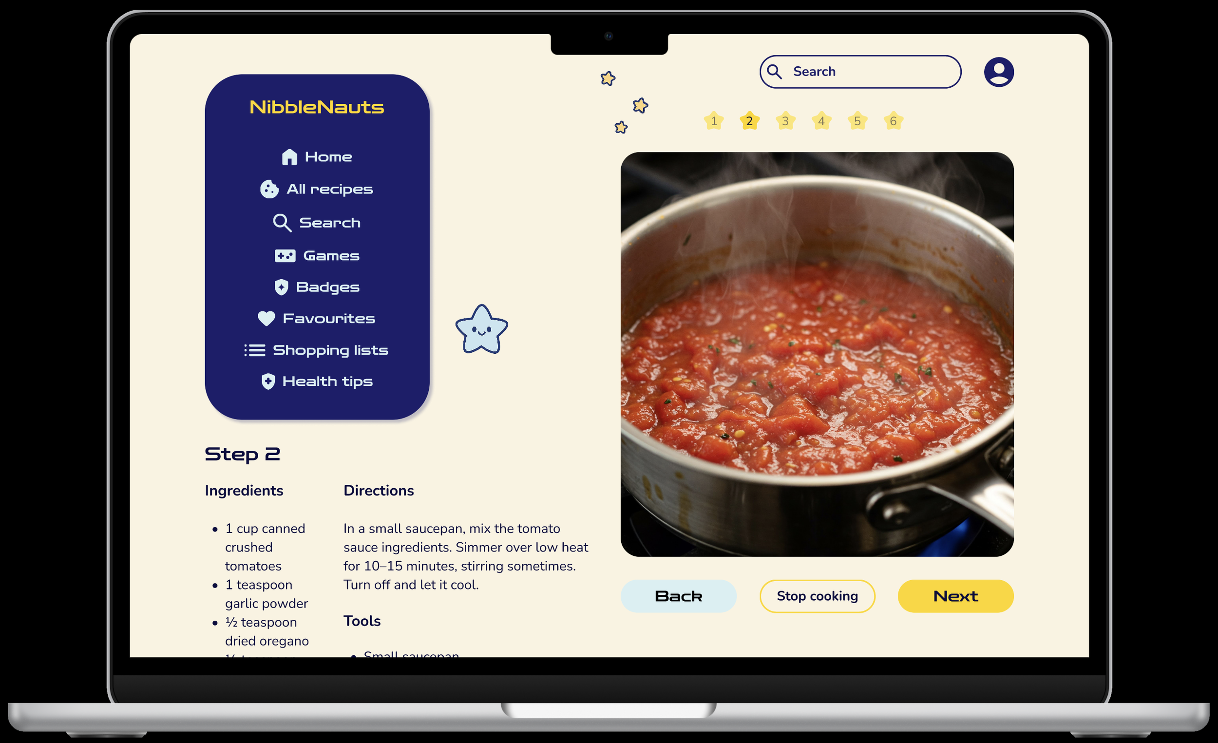
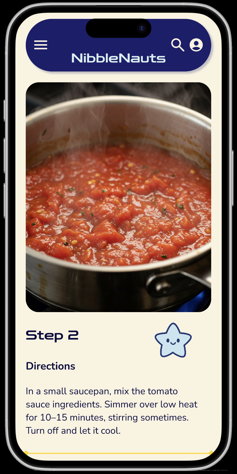
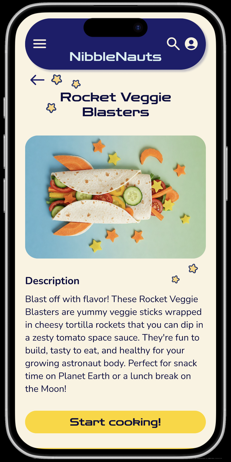
I sketched the first wireframes using pen and paper, planning out each key screen. I kept in mind core features, user pain points and made sure all the elements were included for a clear and easy navigation. On the home screen, I made sure all key features of the website were represented in a quick and easy overview. I also added an engaging header image to motivate the user to start cooking.
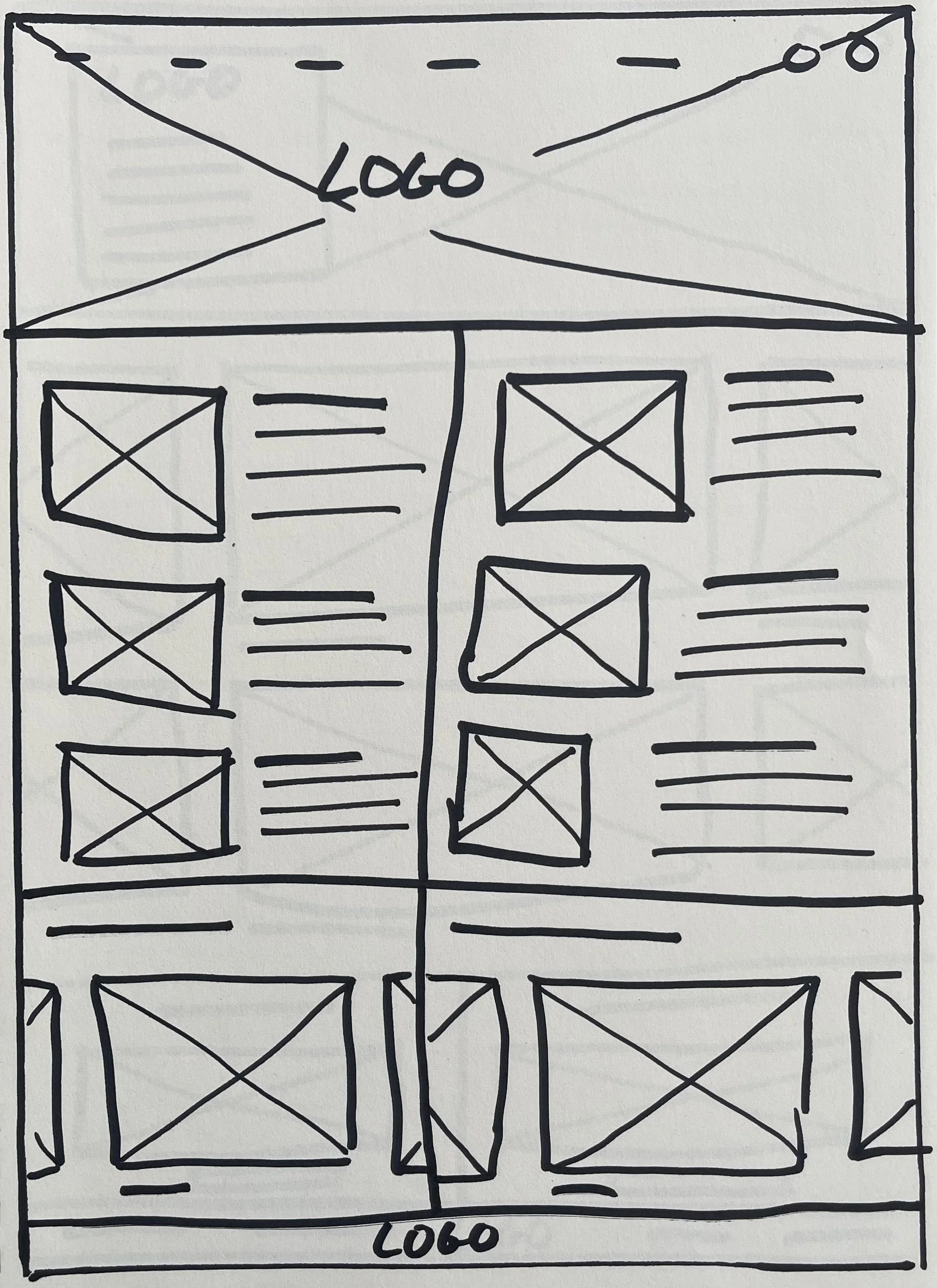
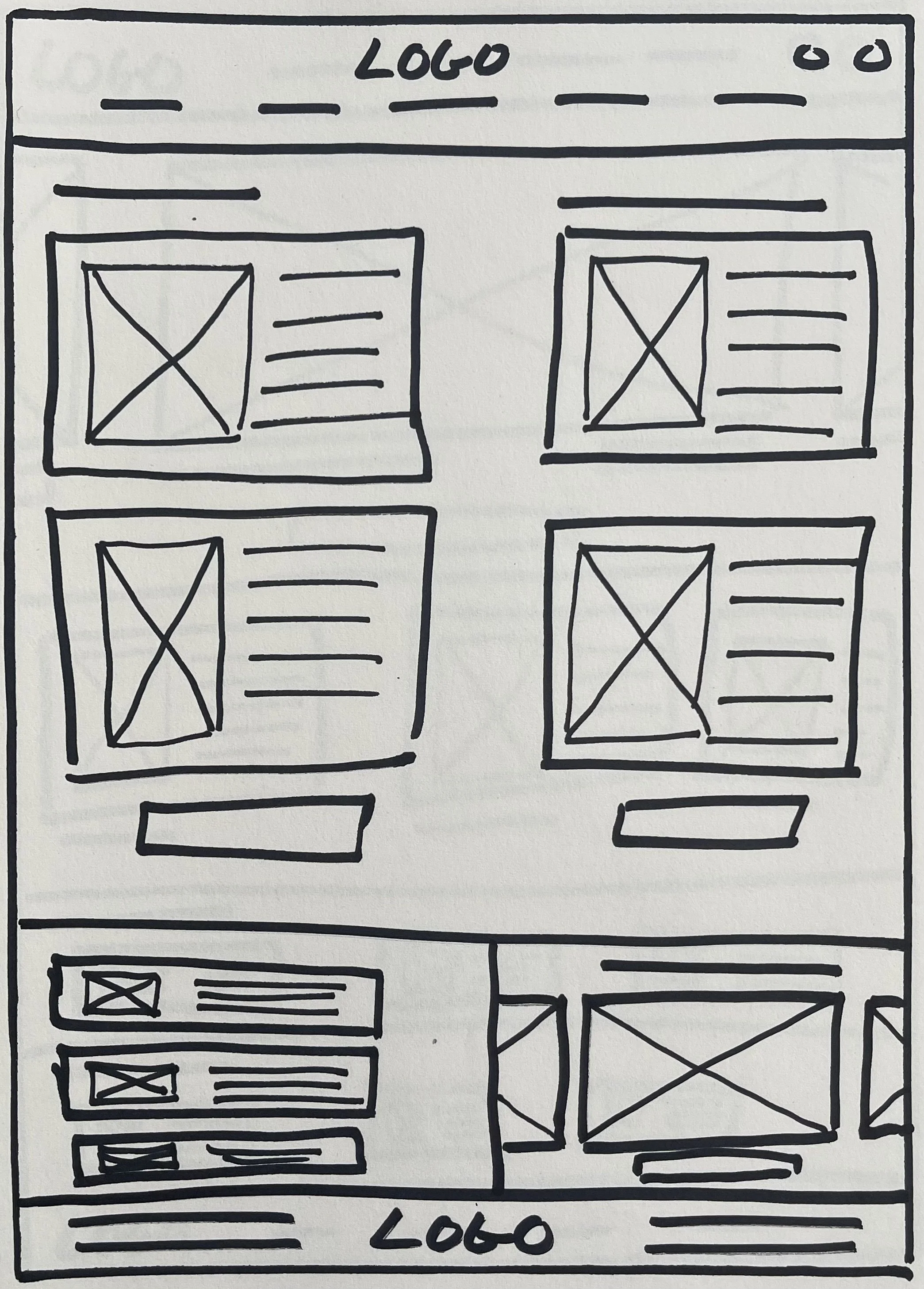
Different elements of each wireframe were used to create a final paper wireframe that would be used for the initial digital wireframe.
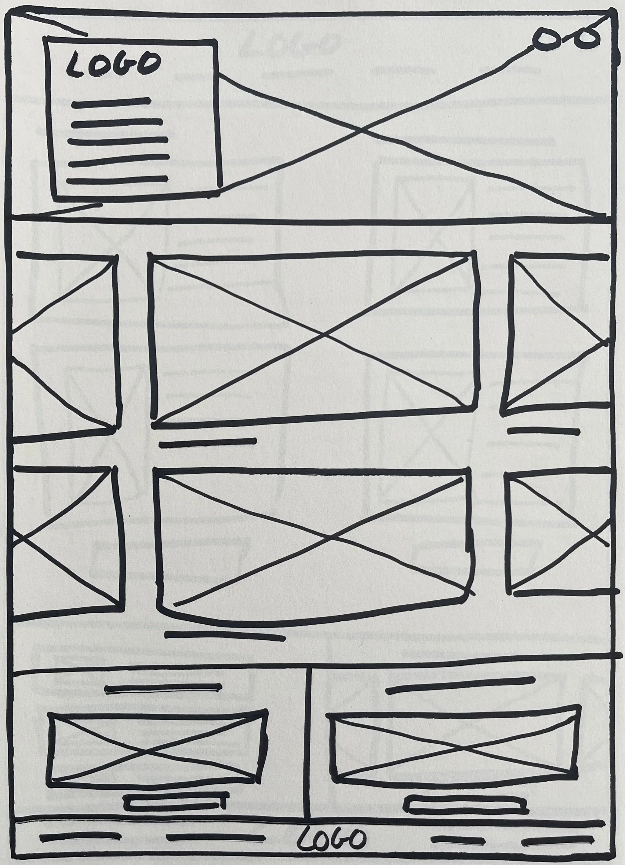
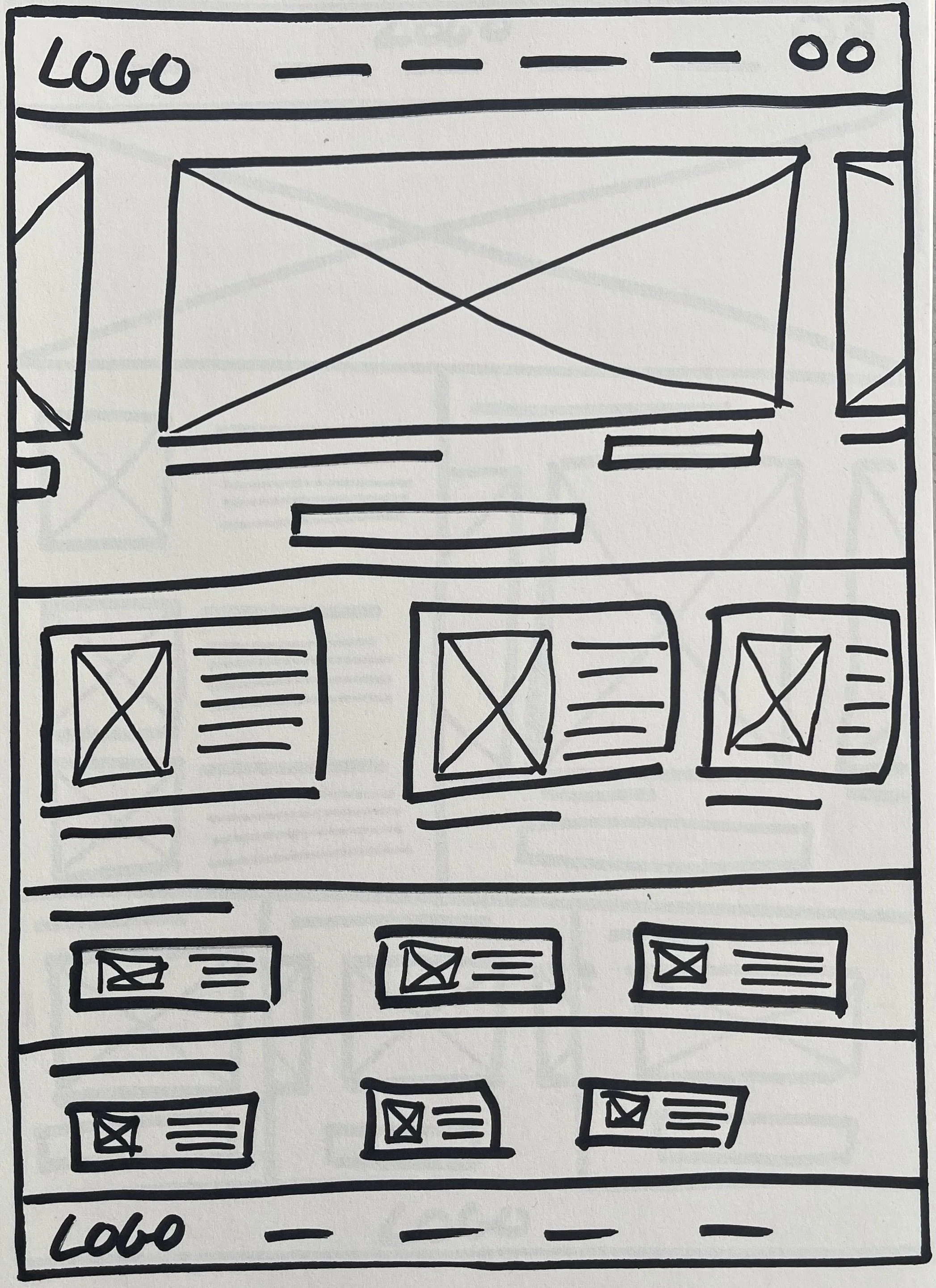
Refined paper wireframe
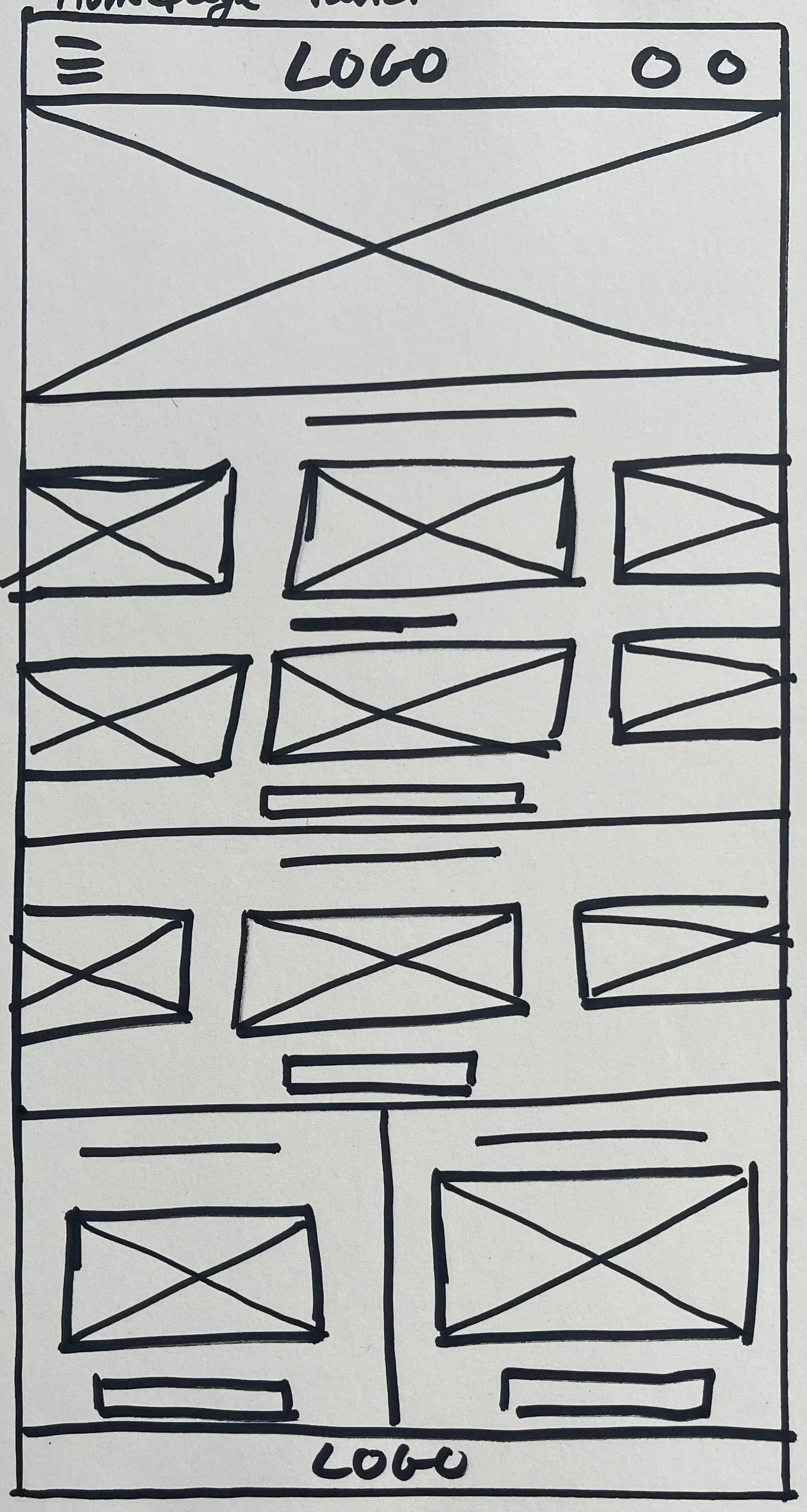
Paper wireframe screen size variations
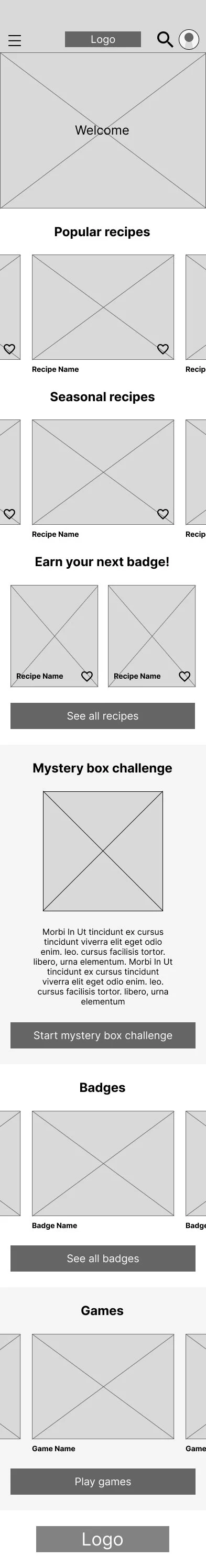
To make sure the website would be fully responsive I created paper wireframes for additional screen sizes. Users use the website on different devices, so it was important to design for mobile and tablet simultaneously.
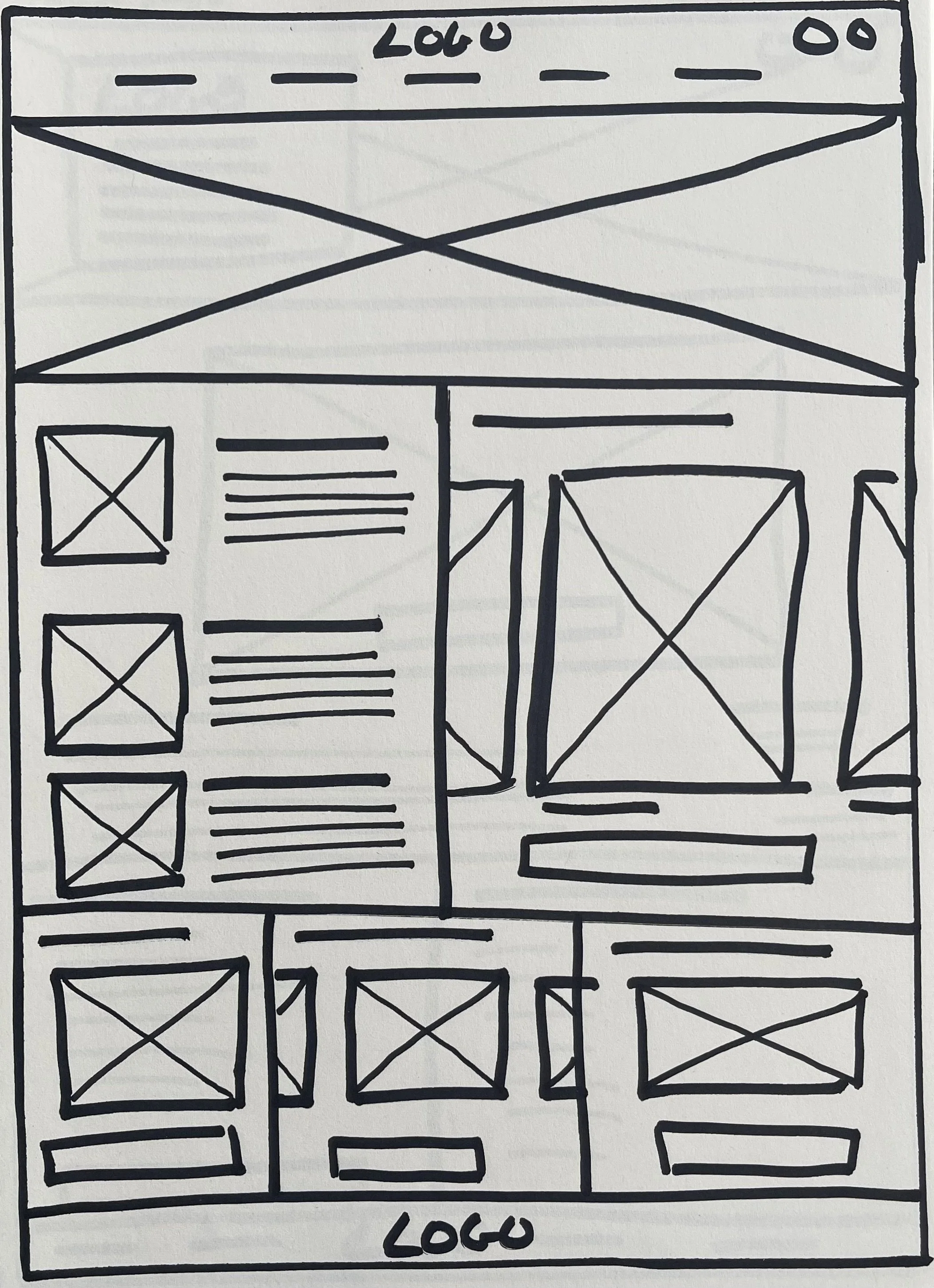
Digital wireframes
Moving from paper wireframes to digital wireframes helped me to improve the user experience and address user pain points. I focussed on clear navigation and easy to locate, and useful, buttons and visual elements. This helped to ensure a smooth and intuitive experience for users.
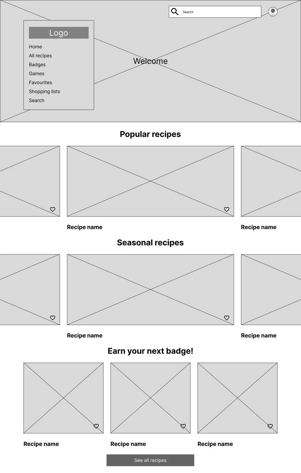
Clear navigation menu with different features on website
Clear overview of featured recipes
Motivational suggestions for recipes to earn your next badge
Preview of different features available on the website
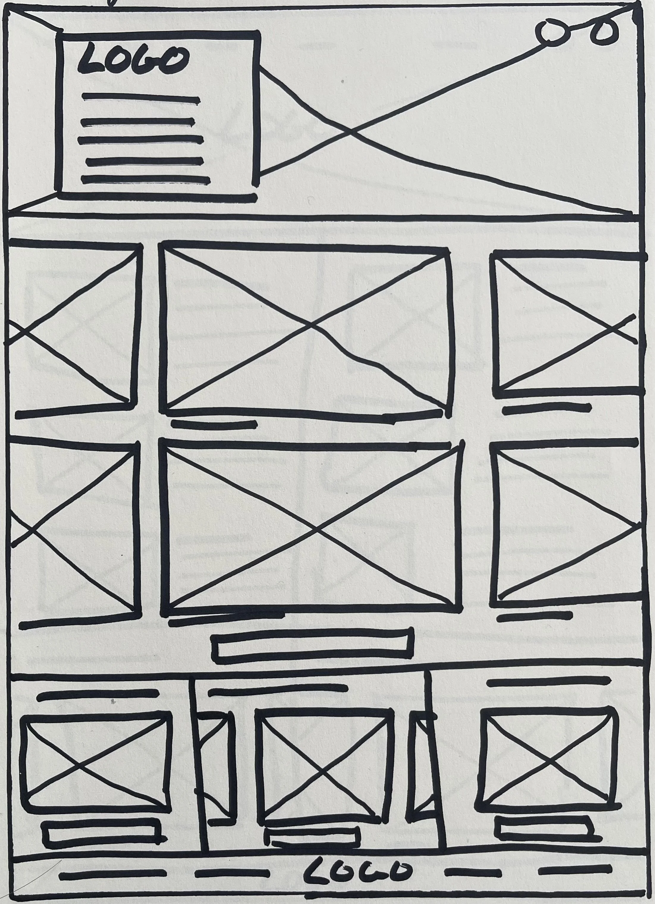
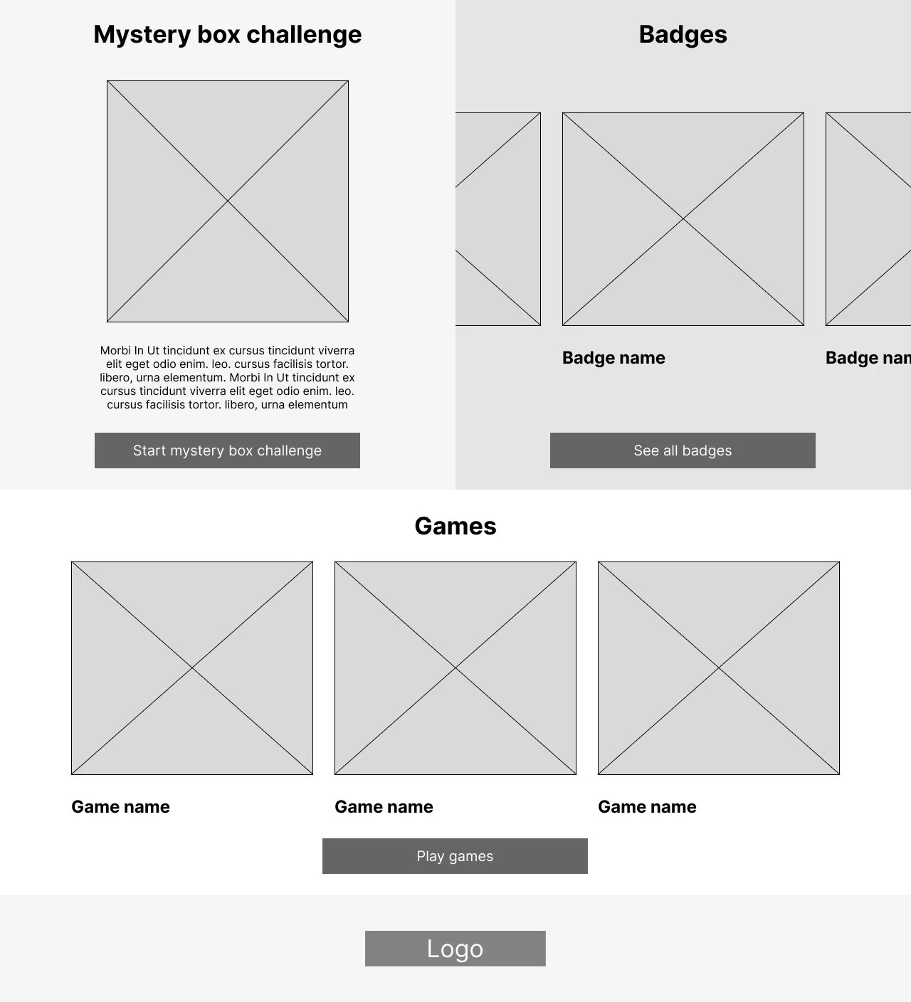
Digital wireframe screen size variations
I also made digital wireframes for additional screen sizes (tablet and mobile), to make sure the website would be fully responsive.

Low fidelity prototype

To create a lo-fi prototype, I connected all the screens from the primary user flow, keeping in mind user’s needs and pain points. At this stage, I was ready to test functionality of the website before starting to incorporate the final design elements and to ensure user accessibility. I addressed key findings and insights from testing by carefully considering feedback and implementing these in the designs.
Usability study
Parameters
Study type:
Unmoderated usability study
Location:
United States & Sweden, remote
Participants:
5 participants
Length:
20-30 minutes
Findings
After finding key insights from the usability study, I identified problems that needed to be solved and helped me guide to refine the designs:
Nutritional facts
Users wanted to know why a recipe is and what makes a recipe healthy. They were missing the nutritional facts in the recipe information and description.
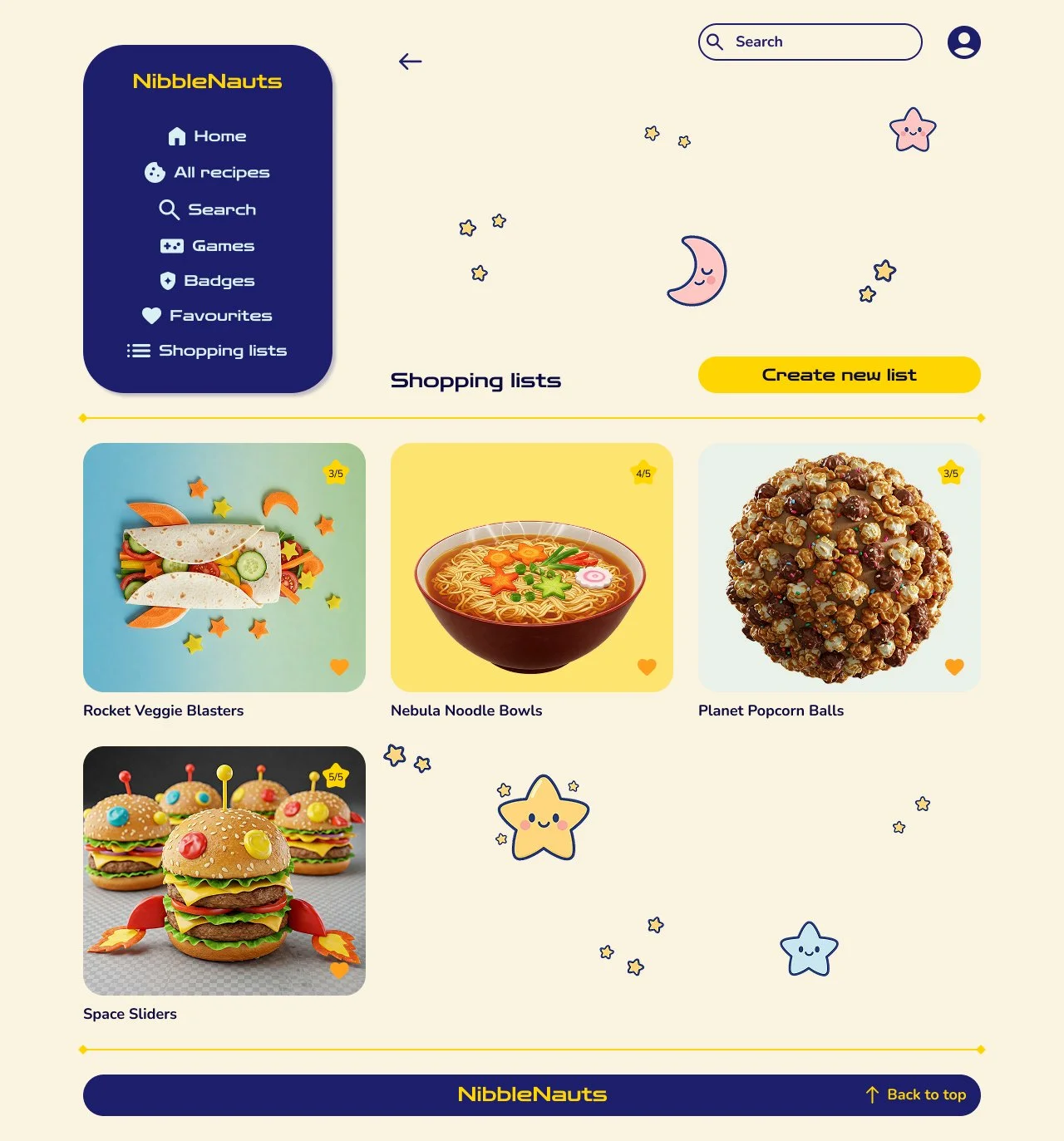
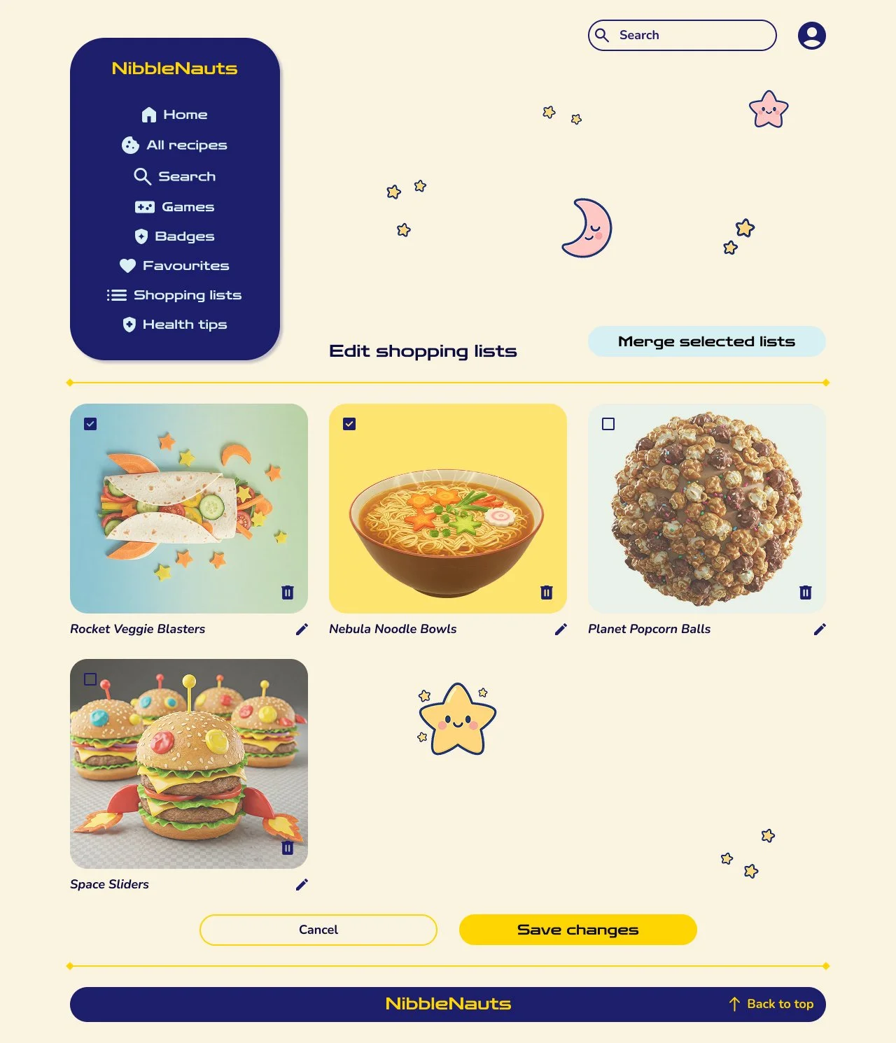
Shopping lists
Users found it hard to differentiate the shopping list cards from the recipe cards, as they looked the same. They were also missing certain editing features of the shopping lists
Font size & clutter
Users had difficulty reading certain pieces of text, as they thought the font size was too small. A few users also noted some of the visuals - mostly the small stars - were or could be distracting on certain pages
Mockups

Before usability study

After usability study
I made changes to different screens based on the insights from the usability study. One of the changes was adding nutritional facts to the recipe information, as users were missing this information and wanted to know how healthy a recipe is and why. I made sure to write them in a fun and playful way for kids to avoid boringness and keep them excited. Users had difficulty reading certain pieces of text, so it was important to increase the font size through the website. Another change I made was to remove some of the visual elements - the small stars - to declutter the website, as user found they were and could be distracting on some pages.

Before usability study


After usability study
To make the shopping list cards clearer, I removed the icons that were the same as on the recipe cards and added a list icon to create a visual cue to let users know they are using a shopping list. I also added an edit button, so users can edit the names, delete them or merge shopping lists together. On the shopping lists themselves, I added an edit button too, so users can edit or remove items. The added drag icons will let users organise their shopping list in the way they prefer.

Before usability study

After usability study
During the usability study it was also noted that users wanted to make certain recipes again, so I included a ‘Make this again!’ section on the homepage.
Original screen size


Screen size variations
Tablet


Mobile

Design system
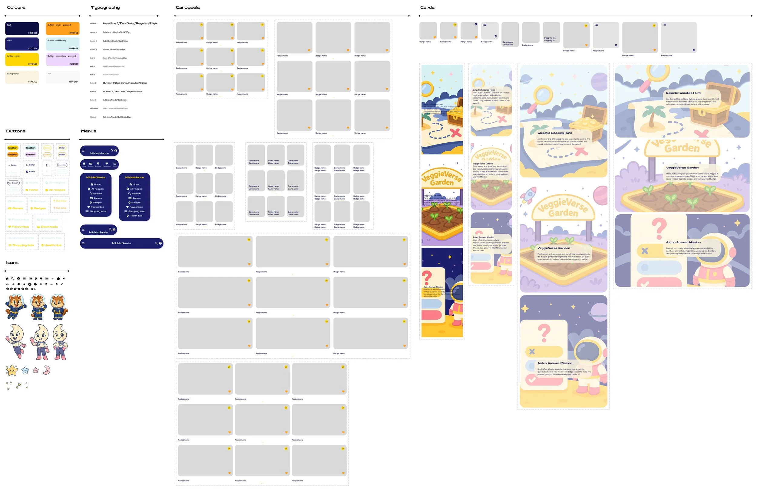
I created a design system for the NibbleNauts mobile app and responsive website, so that I had an organised set of components and principles that I could use whilst designing the mockups. This to create and keep brand identity consistent, but also to save time and ideate design solutions more easily and effectively to solve the user problem.
High fidelity prototype
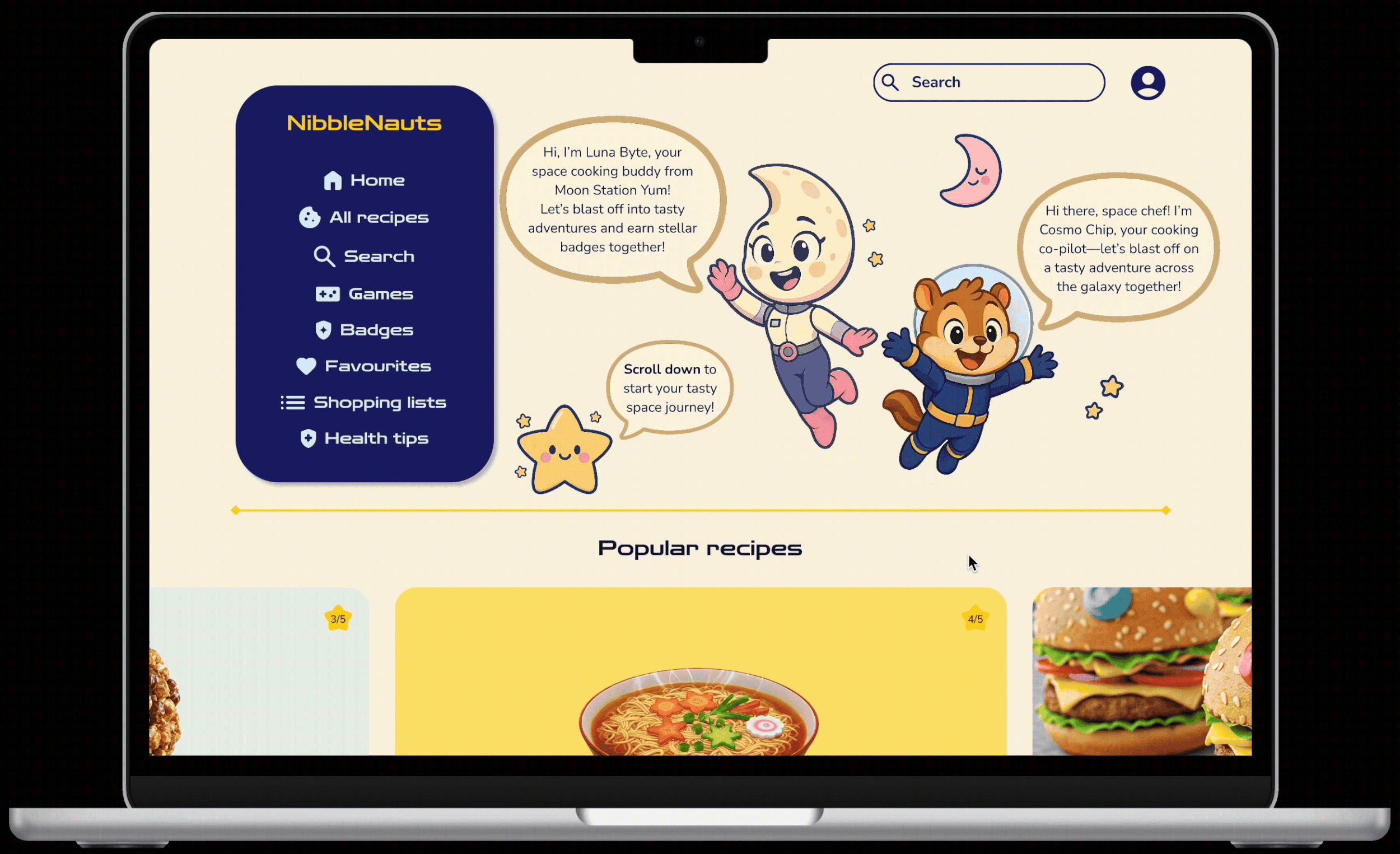
After improving the mockups, I worked on creating a hi-fi prototype that followed the same user flow as the lo-fi prototype. I added several visual and functional design choices, like typography, icons, colour and improved layout, to enhance a smoother navigation flow. After the usability study I included several changes for a better user experience.
Accessibility considerations
To ensure an easy user experience for all users, I provided simple navigation with intuitive icons and clear labels for call-to-action buttons.
By using an online contrast checker (WebAIM), I made sure the contrast between the text and the background was high enough to be easily legible.
To help users differentiate the different sections and information on screen, I implemented clear headers and different text sizes, to create a clear visual hierarchy throughout the website.
I used the Gestalt principle to group similar items together. For example, I used guides to group certain items together and to give visual cues they are different then other elements on the page
Takeaways
Impact
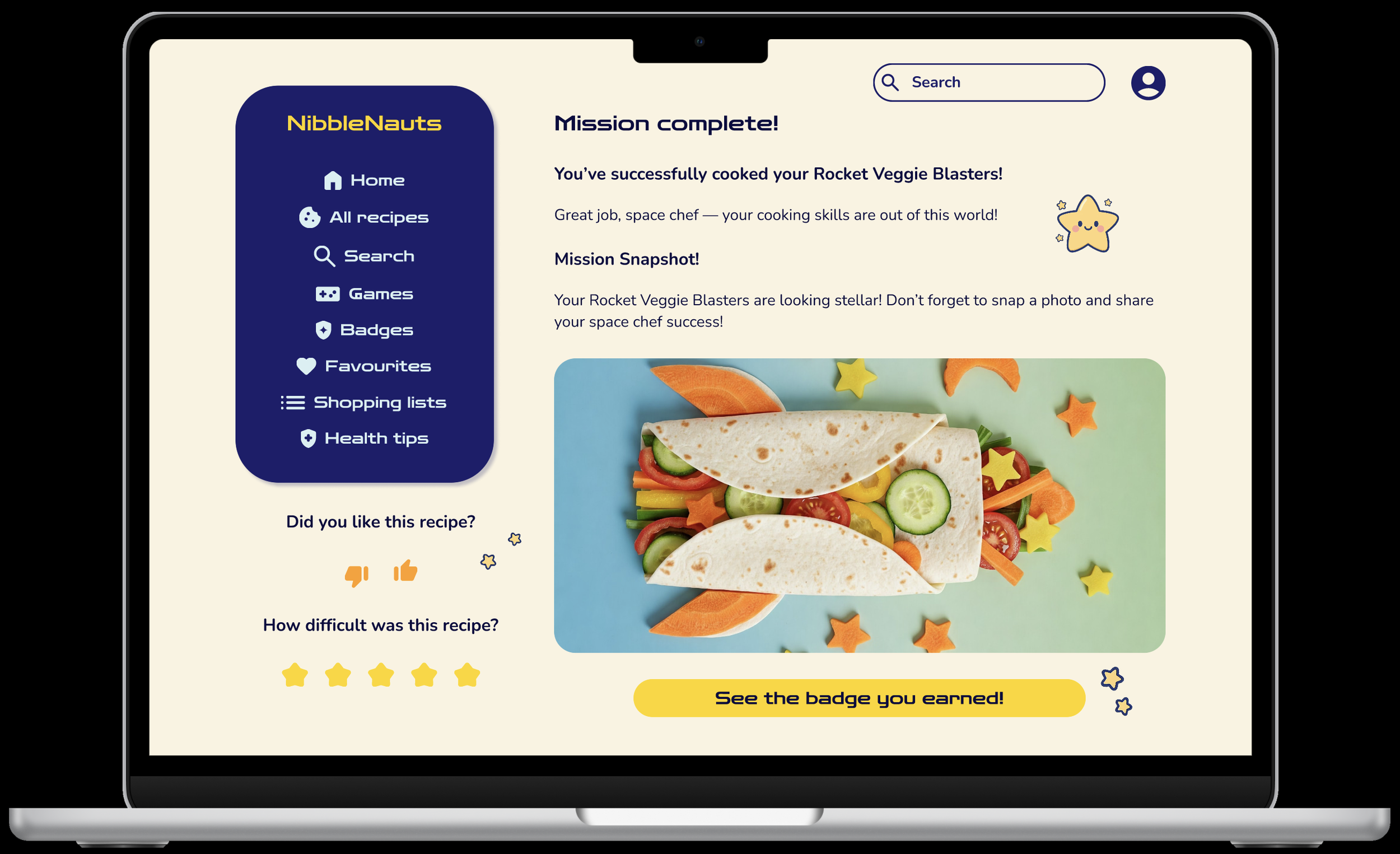
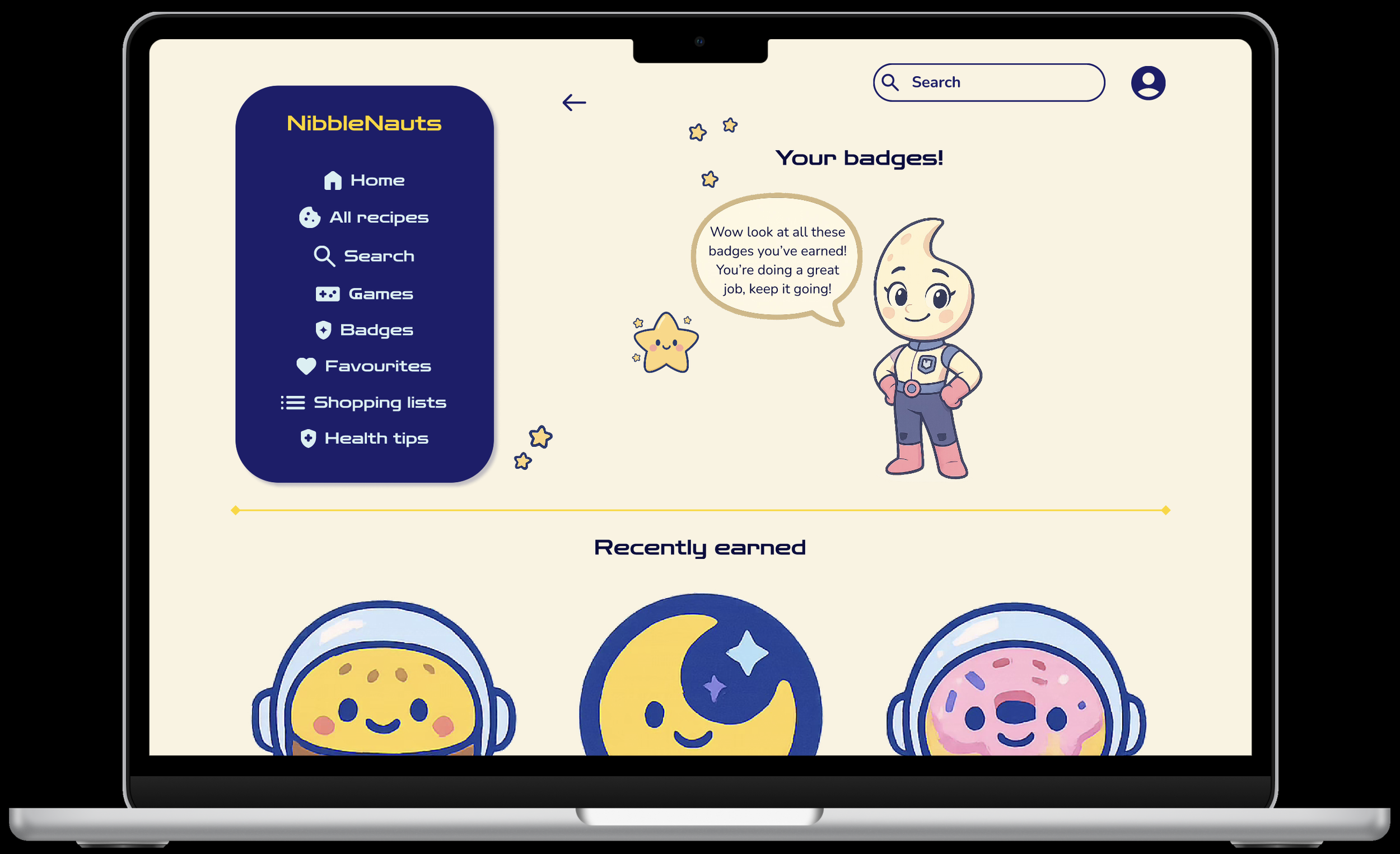
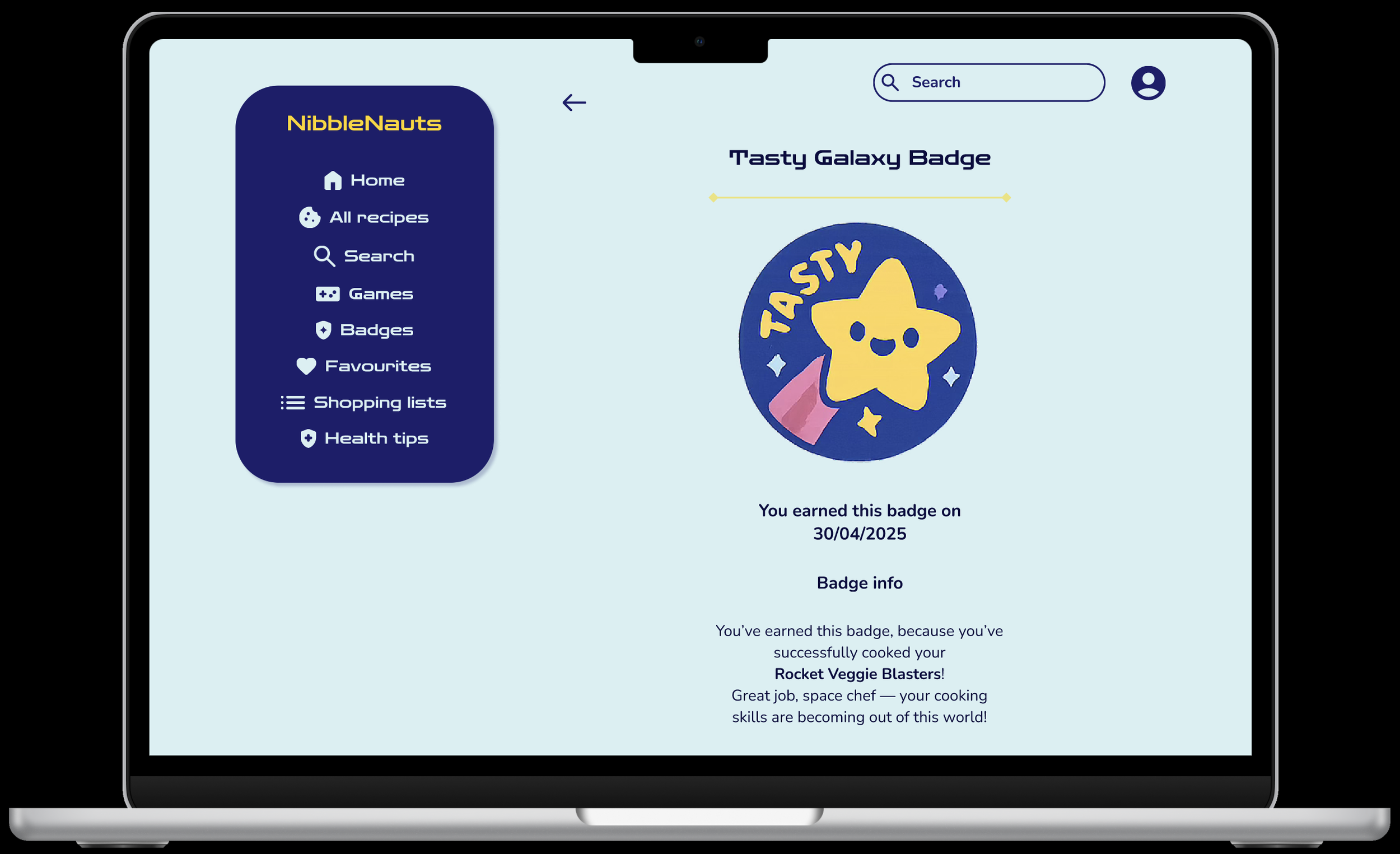
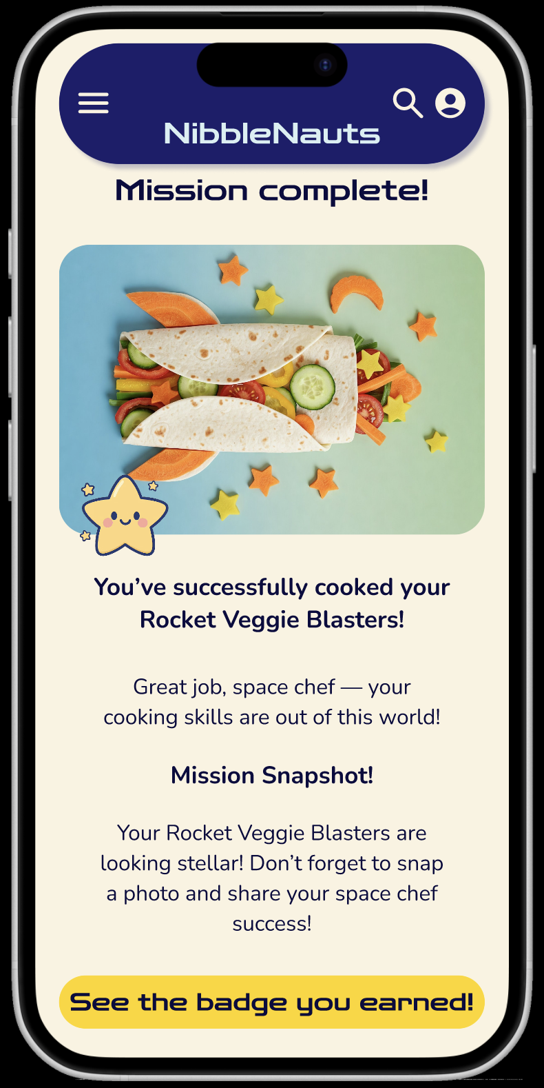
The website helped kids learn and improve their cooking skills, while making healthy recipes in a fun and intuitive way. The different features, such as the mascots, the ability to earn badges and to play games keeps the kids motivated to continue and help them learn fun facts about certain ingredients and recipes.
What I learned
Designing both the NibbleNauts mobile app and responsive website has taught me how to design a human- and user-centred experience for kids, a new and different target audience. This brought it’s challenges, as kids use apps and devices for different reasons and in different ways. I also gained new knowledge on the use of AI in UX design by testing different prompts to create graphics and generate text that I have used throughout the app. I also learned how to create a smooth transition from a user experience on a desktop website to a user experience on smaller screen sizes (tablet and mobile).
Next steps
Conduct more usability studies to obtain and identify areas of improvement and refinement for different features on the website.
Enhance and iterate on safety measures and features on the website to make sure kids can use the website safely and make sure parent(s) and/or guardian(s) do not have to worry about their kid’s safety.
Iterate different ideas to onboard new users and keep current users motivated to continue using the website.
Explore features to include and engage parent(s) and/or guardian(s) in the cooking process to be able to enhance safety and spend quality time with their kids.